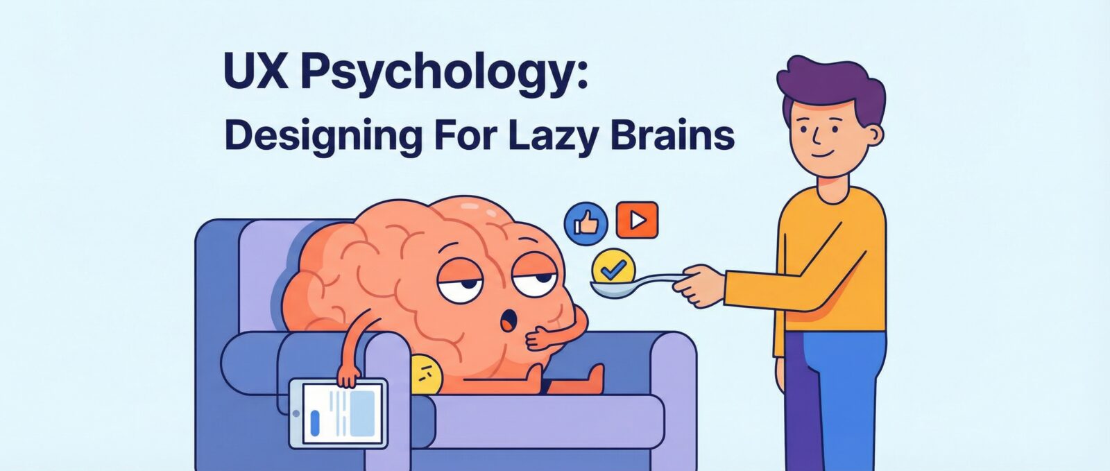
Let’s Be Honest: Your Brain is Lazy
Okay, don’t take that personally. My brain is lazy, too. In fact, every human brain is essentially a highly evolved, squishy computer that is constantly trying to save energy. In the world of web design, this is everything. If you think users are rationally analyzing every pixel of your site, you are wrong. They are scanning, skimming, and desperately looking for the path of least resistance.
This is where ux psychology comes in. It’s not about mind control (mostly); it’s about understanding the weird shortcuts our brains take. If you want to master conversion optimization, you have to stop designing for robots and start designing for these messy, irrational humans.
Even if you use the best AI design tools: because moving rectangles sucks, the AI doesn’t always know why a user clicks a button. But you will.
The “Ooh, Shiny!” Effect (Von Restorff Effect)
Imagine a basket of ten green apples and one bright red apple. Which one do you look at? The red one. Obviously.
This is the Von Restorff Effect, also known as the Isolation Effect. It states that when multiple similar objects are present, the one that differs from the rest is most likely to be remembered. In behavioral design, this is your best friend.
If your “Buy Now” button is the same color as your navigation menu, your footer, and your headlines, nobody is going to click it. They won’t even see it. They will gloss over it like it’s a terms of service agreement.
To make this work:
- Make your Call to Action (CTA) a color that isn’t used anywhere else on the page.
- Use whitespace. Lots of it. If you crowd your content, nothing stands out. You want a clean look, not a digital hoarding situation.
- Speaking of clean, check out stop killing polar bears with your bloated website to see why minimalism saves the planet (and your user’s sanity).
See It In Action
Hick’s Law: Don’t Make Me Think
Have you ever stood in the cereal aisle at the grocery store and felt a mild panic attack because there are 400 types of flakes? That is decision paralysis. In the UX world, we call this Hick’s Law: the time it takes to make a decision increases with the number and complexity of choices.
If you give a user 20 links to click on your homepage, they will click zero. They will leave. They will go back to TikTok.
To fix this, you need to organize your content better. A great way to do this is by compartmentalizing information. You might want to try Bento Grids: Marie Kondo for your messy website. It helps break down complex choices into bite-sized, digestible chunks.
The Need for Speed (Doherty Threshold)
Here is a harsh truth: modern humans have the patience of a goldfish that drank too much espresso. There is a cognitive bias related to time called the Doherty Threshold. It basically says that productivity soars when a computer and its user interact at a pace that ensures neither has to wait on the other (usually under 400 milliseconds).
If your site loads slowly, users perceive it as broken or untrustworthy. They don’t think, “Oh, the server must be busy.” They think, “This site sucks.”
You need to optimize your performance. You should definitely read Core Web Vitals: Why Google hates your slow turtle site. If you are running on WordPress and it feels like it’s stuck in mud, go check out how to kick your slow WordPress site’s butt into gear.
Social Proof: The “Everyone Else is Doing It” Bias
We are herd animals. If we see a long line outside a restaurant, we assume the food is good. If we see an empty restaurant, we assume we will get food poisoning.
In web design, this is Social Proof. You need testimonials, reviews, and subscriber counts. If your site looks like a ghost town, people won’t trust you. This is why engagement matters. If you feel like you are shouting into the void, read your website’s social life sucks? Let’s fix it.
The “I Can’t Read This” Problem
Sometimes, we get so caught up in making things look “aesthetic” that we forget people actually need to read the words. Designing with low contrast or tiny text is a massive failure in behavioral design. If I have to squint, I am closing the tab.
Don’t be the person who puts light gray text on a white background. It’s rude. For a deep dive on this, please read Stop Hiding Text: A Guide to Not Being a Web Design Jerk.
Final Thoughts
Designing for the human brain isn’t about tricking people. It’s about empathy. It’s about realizing that your users are tired, distracted, and looking for an easy answer. By using these cognitive biases responsibly, you can build a site that feels intuitive, fast, and helpful. And that is how you win the internet.
