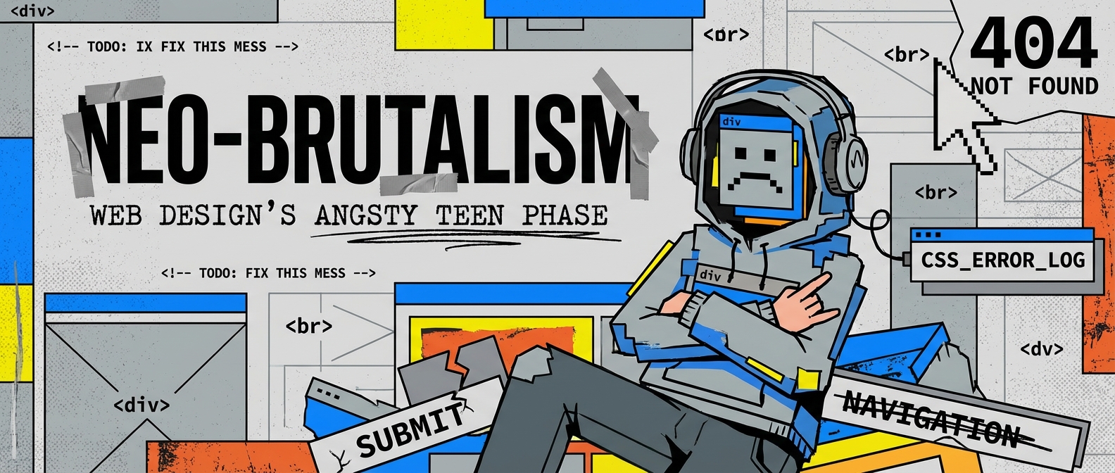
Meet the Rebellious Teenager of Web Design
Lately, I’ve been scrolling through the internet and feeling… bored. Every website looks like it graduated from the same Swiss design school, wears beige turtlenecks, and only drinks oat milk lattes. It’s all clean lines, soft gradients, and so much minimalist white space you could land a 747 in it. It’s safe. It’s predictable. It’s putting me to sleep.
But then, every so often, I stumble upon a website that feels like a splash of ice-cold water to the face. It’s loud, chaotic, and unapologetically itself. It’s got clashing colors, harsh lines, and fonts that look like they were typed on a Cold War-era computer. My friends, you’ve just met neo-brutalism.
This is not your grandma’s gentle, user-friendly design. This is the punk rock concert of web aesthetics, and it’s one of the most exciting web design trends I’ve seen in years.
So, What Exactly is This Digital Concrete Jungle?
The term “brutalism” originally comes from architecture, where it described massive, blocky buildings made of raw, exposed concrete (from the French béton brut, or “raw concrete”). Think imposing, functional, and zero-frills government buildings. They weren’t trying to be pretty; they were trying to be honest.
Neo-brutalism in web design takes that same spirit and runs with it. It’s a rebellion against the pixel-perfect, overly polished aesthetic that has dominated the digital landscape. It strips away the decorative fluff and exposes the raw structure underneath. It’s honest, sometimes to a fault, and it absolutely does not care about your feelings.
The Core Principles of Neo-Brutalist Design
Think you can just throw random colors and giant text on a page and call it a day? Well, almost. But there’s a method to the madness. Here are the key ingredients:
- Raw, Unstyled-ish Elements: Remember default HTML buttons and plain blue hyperlinks? They’re back. Neo-brutalism embraces the default look of web elements, giving it a raw, almost “under construction” vibe. It’s a bold move to stop hiding text behind fancy buttons and just let it be.
- Extreme High Contrast Design: Forget subtle shades of grey. We’re talking pure black on pure white, or even more jarring combinations like neon green on electric blue. This high contrast design is meant to be seen, even if it makes your eyes water a little.
- Monolithic Typography: Fonts are often huge, blocky, and frequently monospaced (where every character takes up the same amount of space, like a typewriter). The text isn’t just for reading; it’s a major design element in itself.
- Unconventional Layouts That Mock the Grid: While some designers are meticulously organizing their content into neat little Bento Grids, neo-brutalists are throwing elements around with reckless abandon. These unconventional layouts often feature overlapping elements, stark divisions, and a general disregard for traditional alignment.
- Visible Borders and Outlines: Everything gets a thick, black border. It’s like every element is yelling, “I AM HERE, IN THIS BOX!” There’s no gentle blending or soft shadows.
Why Is This Happening? A Digital Rebellion
Neo-brutalism isn’t just a stylistic choice; it’s a philosophical one. It’s a reaction. While some trends like Glassmorphism and Mesh Gradients aim for a soft, ethereal, almost magical user interface, neo-brutalism grounds us in a stark reality. It’s the digital equivalent of a garage band in a world of overproduced pop music.
It’s also surprisingly functional. By ditching heavy images, complex scripts, and fancy CSS, these sites can be incredibly lightweight and fast. They’re a middle finger to bloated codebases and slow loading times.
Can You Actually Use It Without Getting Fired?
Okay, so you’re probably not going to redesign your bank’s website in a neo-brutalist style. This aesthetic is not for the faint of heart and can be a usability nightmare if not handled with care. A jarring, chaotic interface can be a real challenge for designing for lazy brains, as it demands attention and effort from the user.
However, for the right brand—a creative agency, a musician, a fashion label that wants to project a cutting-edge image—it can be a spectacular way to stand out. It communicates confidence, authenticity, and a refusal to play by the rules. It can make for an unforgettable hero section that grabs a user’s attention immediately.
The key is to use its principles thoughtfully. You can adopt a “brutalism-lite” approach—using strong typography and a high-contrast color scheme but keeping the layout relatively sane. The goal is to be bold, not to give your users a migraine.
The Future is Raw and Unfiltered
Neo-brutalism is a refreshing dose of personality in a digital world that often feels sterile. It’s a reminder that web design can be art, it can be a statement, and it doesn’t always have to be polite. As we look at the spectrum of design possibilities, from minimalist empty space to rainbow explosions, neo-brutalism carves out a powerful, unapologetic niche.
It might not be one of the AI web design trends that promises to automate everything, but it’s a testament to the enduring power of human creativity and our desire to, every once in a while, break all the rules.
