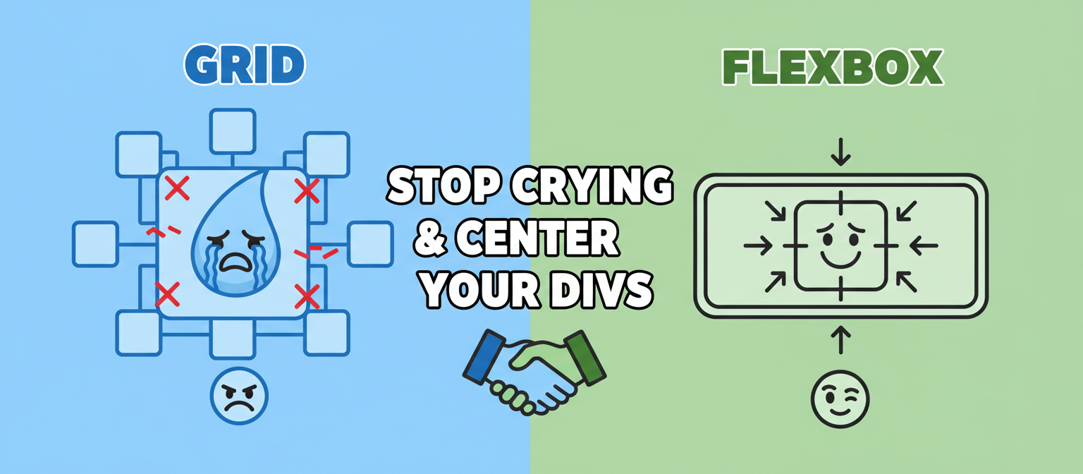
The Ultimate Frontend Cage Match: CSS Grid vs. Flexbox
Ah, the great CSS layout debate. If you’ve spent any time in the wild world of frontend development, you’ve stumbled upon this question: Should I use CSS Grid or Flexbox? It feels like choosing between a lightsaber and a blaster—both are awesome, but they’re for different kinds of fights. For years, we were stuck using floats and `position: absolute` to build layouts, which was like trying to build a house with duct tape and hope. It was a dark time.
But then, the clouds parted, and we were gifted two powerful tools for creating a proper CSS layout. The problem? Many developers treat them as interchangeable, leading to code that’s more confusing than the plot of a Christopher Nolan film. Let’s break down this legendary rivalry so you can finally stop crying while trying to center a div.
Meet Flexbox: The One-Dimensional Wonder
Think of Flexbox as a specialist. It’s designed to arrange items in a single dimension—either in a row or in a column. Imagine you’re lining up your action figures on a shelf. You can spread them out evenly, bunch them together at one end, or put them in the middle. That’s Flexbox.
Its superpower is its ability to handle alignment and space distribution among items in a container. It’s “content-first,” meaning the size of your content can influence the final layout. The items can grow, shrink, and reorder themselves with surprising ease.
When to Unleash Flexbox:
- Component-Level Layouts: It’s the undisputed champion for arranging items within a small component. Think navigation links in a header, buttons in a form, or items in a product card.
- Perfect Alignment: Need to vertically align something? Horizontally center a group of items? Flexbox is your best friend. It makes crafting the perfect hero section a breeze.
- Single-Axis Control: Any time you’re thinking, “I just need to line these things up,” reach for Flexbox. It excels at distributing space along one axis.
Enter CSS Grid: The Two-Dimensional Titan
If Flexbox is a specialist, CSS Grid is the master strategist. Grid was built for two-dimensional layouts—controlling both columns and rows simultaneously. It’s “layout-first.” You define a grid, and then you place items into its cells. It’s less about how the content wants to flow and more about you, the developer, dictating the structure.
Think of a spreadsheet, a chessboard, or a comic book page. That’s CSS Grid. It gives you god-like control over the entire page structure, allowing you to create complex, responsive layouts that would have been a nightmare just a few years ago. This is the magic behind those trendy Bento Grids you see everywhere.
When to Call in the Grid:
- Overall Page Layout: When you’re mapping out the main regions of your site (header, sidebar, main content, footer), CSS Grid is the right tool for the job.
- Complex, Two-Dimensional Designs: Building an image gallery, a calendar, or one of those complex data dashboards? Grid’s ability to manage rows and columns at the same time is essential.
- Overlapping Elements: Grid makes it surprisingly simple to overlap items, which can be fantastic for more creative or artistic designs.
See It In Action
The Twist: They’re Not Enemies, They’re Partners
Here’s the secret the “vs.” articles won’t tell you: the most powerful approach is to use them together. It’s not a choice between one or the other; it’s about using the right tool for the right task to avoid creating a Frankenstein UI.
My typical workflow looks like this:
- I use CSS Grid to define the main structure of the page. I’ll create a grid container for the primary sections like the header, main content area, and footer.
- Then, inside one of those grid items—say, the header—I’ll use Flexbox to arrange the logo on the left and the navigation links on the right.
- Inside the main content area (which is a grid item), I might have a list of blog posts. I could use Grid again for a card layout or Flexbox to style the content inside each individual card.
They complement each other perfectly. Grid draws the blueprint for the house, and Flexbox arranges the furniture in each room.
What About Responsive Design?
Both tools are fantastic for creating responsive websites that don’t make your users want to throw their phones. This is a crucial part of modern frontend development, especially if you care about your Core Web Vitals and providing a decent mobile UX. Flexbox’s `flex-wrap` property is great for letting items stack on smaller screens. Grid, with `fr` units and `minmax()`, allows you to create fluid, intelligent columns that reflow beautifully.
The Final Verdict
Let’s put this debate to rest. There is no “winner” because it’s not a competition.
- Use Flexbox for arranging items along a single axis (a row or a column). It’s perfect for components and content-driven alignment.
- Use CSS Grid for creating two-dimensional, page-level layouts. It’s ideal for structure and layout-driven designs.
Embrace both. Learn their strengths. Use them together. Your code will be cleaner, your layouts will be stronger, and you’ll spend a lot less time wondering why your div won’t center. It’s one of the best ways to learn how to code without crying. Now go forth and build amazing things, leaving the dark age of floats behind forever.
