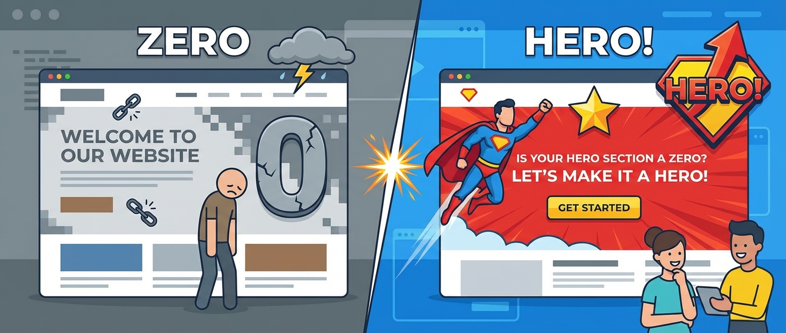
Your Hero Section is Your Website’s Handshake. Is Yours Clammy?
Let’s be honest. Your website’s hero section is the first thing anyone sees. It’s the digital equivalent of a first impression. You have about three seconds to convince a visitor that you’re not a weirdo and that they should stick around. This is your prime real estate, the valuable content that appears “above the fold” before anyone has to scroll. If you mess this up, they’ll bounce faster than my cat when he hears the vacuum cleaner. Effective hero section design isn’t just about making things pretty; it’s the cornerstone of solid landing page optimization.
For years, I treated my hero sections like a digital junk drawer. A vague headline here, a stock photo there, a button that said “Click Me” because I lacked imagination. Unsurprisingly, my conversion rates were abysmal. So, I decided to stop treating this critical space like an afterthought and start treating it like the conversion-driving powerhouse it’s meant to be. Here’s what I learned.
The Holy Trinity of a High-Converting Hero Section
Forget complicated formulas. A hero section that actually works boils down to three key components. Get these right, and you’re 90% of the way there. Get them wrong, and you might as well replace your website with a “Coming Soon” page from 1998.
See It In Action
1. The Headline: Your 3-Second Sales Pitch
Your headline is not the place for corporate jargon or buzzwords that sound like they were generated by a confused AI. Nobody is “synergizing paradigms” here. Your headline must do one thing: clearly and instantly communicate the value you offer.
- Be Clear, Not Clever: Your visitor should know exactly what you do without needing a thesaurus. Instead of “Architecting Future-Proof Digital Ecosystems,” try “We Build Websites That Make You Money.” See? Simple.
- Focus on the Benefit: People don’t care about your product’s features; they care about what it does for them. Don’t sell the drill, sell the hole in the wall. This is a core concept of designing for lazy brains; make the value proposition effortless to understand.
- Address a Pain Point: What problem are you solving? Your headline should feel like a life raft to a visitor drowning in a specific problem.
2. The Visual: The Supporting Actor That Steals the Show
A picture is worth a thousand words, but a bad one is worth a thousand bounces. Your hero image or video isn’t just decoration; it’s there to support your headline and evoke an emotional response. A photo of your smiling team is better than a generic stock photo of people in suits high-fiving.
Your visual choice also sets the tone. Are you a sleek tech company? Maybe some tasteful 3D web design elements are in order. Are you a creative agency? Perhaps some hypnotic mesh gradients will do the trick. Whatever you choose, ensure it establishes a strong visual hierarchy, guiding the user’s eye directly to the most important elements—like your headline and call-to-action.
3. The Call-to-Action (CTA): The Big, Shiny Button of Destiny
Your CTA is the final piece of the puzzle. It’s the action you want the user to take. If your headline and visuals did their job, the user should be primed and ready to click. Don’t make them hunt for it.
- Make it Obvious: Your CTA button should stand out. Use a contrasting color that pops against the background. Don’t make it blend in like a chameleon at a paint store.
- Use Action-Oriented Text: Ditch boring words like “Submit” or “Enter.” Use commanding verbs that promise a result. “Get Your Free Quote,” “Start My Trial,” or “Download the Guide” are much more compelling.
- One Main Goal: Avoid cluttering your hero section with multiple, competing CTAs. Give the user one clear path to follow. Giving them too many choices often leads to them choosing none at all. A little micro-interaction on hover or click can also make the experience more delightful.
The “Don’t You Dare” List for Hero Sections
Now that you know what to do, here are a few things you should absolutely, positively never do. I’ve made all these mistakes so you don’t have to.
- Don’t Be a Snail: A massive, unoptimized hero image or video will destroy your load time. Nothing kills conversions faster than a slow website. Remember, Google hates slow sites, and you want to keep your Core Web Vitals in the green. Don’t be the reason we’re killing polar bears with bloated websites.
- Don’t Be Vague: If I can’t figure out what you do in three seconds, I’m gone. Clarity is king, queen, and the entire royal court. This is not the time to hide your value proposition behind fluffy marketing speak. As I’ve said before, it’s crucial to stop hiding text.
- Don’t Forget Mobile: Over half of all web traffic is on mobile. If your hero section is a jumbled mess on a phone, you’re alienating the majority of your audience. Test it, then test it again. Your users will thank you if you don’t break their thumbs with a terrible mobile layout.
Optimizing your hero section isn’t rocket science, but it does require thought and intention. By focusing on a clear headline, a supportive visual, and an unmissable CTA, you can transform that prime digital real estate from a passive billboard into an active conversion machine. Now go on, give your website a handshake that people will actually want to shake back.
