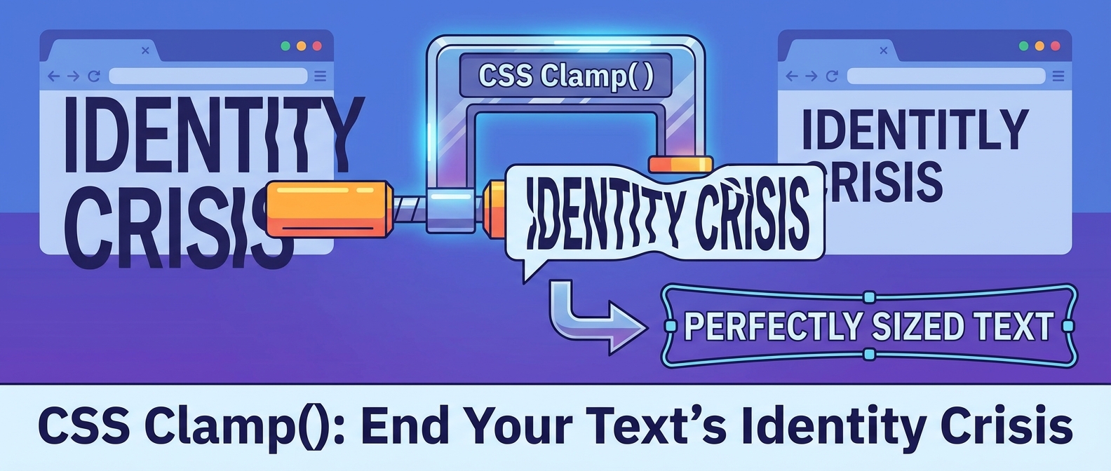
Your Text Has a Sizing Problem. Let’s Fix It.
Ever designed a gorgeous headline on your big fancy monitor, only to look at it on your phone and see it screaming at you like a drill sergeant? Or maybe it’s the opposite. The text is so tiny you need a microscope to read it. You’ve fallen into the responsive design trap, my friend. You’re painstakingly writing media queries for every possible device width, and your CSS file is starting to look like a novel written by a madman.
This is how you end up with a Frankenstein UI, where your text has a different personality on every screen. The header is bold and confident on a laptop, shy and microscopic on a tablet, and obnoxiously loud on a phone. It’s inconsistent, it’s ugly, and it’s a pain to maintain. But what if I told you there’s a better way? A way for your text to flow seamlessly, scaling perfectly for every single viewport? Say hello to fluid typography.
See It In Action
The Old Way: Breakpoints on Breakpoints
For years, our solution to responsive text was a blunt instrument: media queries. We’d pick a few common device widths—say, 320px, 768px, and 1024px—and write specific font sizes for each. It looked something like this:
/* This is fine */
h2 { font-size: 3rem; }

/* Oh, for tablets... */
@media (max-width: 768px) {
  h2 { font-size: 2.5rem; }
}

/* And phones... */
@media (max-width: 480px) {
  h2 { font-size: 2rem; }
}
The problem? The internet isn’t just three screen sizes. It’s an infinite continuum of widths. With the breakpoint method, your text looks great at 768px, but at 769px? BAM. It suddenly jumps to a new size. This jarring experience is the opposite of the smooth, cinematic feel you might be aiming for with something like scrollytelling. It’s also just more code to maintain, bloating your CSS and hurting your Core Web Vitals.
Fluid Typography: The Smooth Solution for Modern CSS Sizing
Fluid typography does exactly what it says on the tin. Instead of defining rigid sizes at fixed breakpoints, the text size grows and shrinks smoothly along with the viewport width. No more jumps, no more awkward in-between sizes. It’s the typographic equivalent of pouring water into a glass—it just fits perfectly, every time.
This is where the magical CSS clamp() function comes in. If you’ve ever tried to center a div, you know that modern CSS has some powerful tricks up its sleeve. The clamp() function is one of the best.
Meet Your New Best Friend: The `clamp()` Function
The `clamp()` function is your bouncer for font sizes. It takes three values and ensures your text never gets out of line. It looks like this: `font-size: clamp(MIN, PREFERRED, MAX);`
- MIN: This is the absolute minimum size. Your text will never, ever shrink smaller than this. This is crucial for accessibility and making sure you don’t break my thumbs or my eyes on mobile. We don’t want to be web design jerks.
- PREFERRED: This is the flexible, “ideal” value. It’s usually a calculation based on the viewport width (using units like `vw`). This is what makes the typography fluid.
- MAX: This is the absolute maximum size. It stops your headline from taking over the entire screen on a 4K monitor. Think of it as a ceiling.
Let’s look at a practical example for a headline:
h2 {
  font-size: clamp(2rem, 1rem + 5vw, 4.5rem);
}
Here’s what’s happening in plain English:
- “Try to be `1rem + 5vw`.” The browser calculates a size based on 1 rem plus 5% of the viewport’s width. As the screen gets wider, this value increases.
- “But never go below `2rem`.” On the tiniest mobile screens, that calculation might result in a value less than 2rem. `clamp()` steps in and says, “Nope, the minimum is 2rem.”
- “And for the love of all that is holy, don’t get bigger than `4.5rem`.” On a massive desktop monitor, `1rem + 5vw` could become enormous. `clamp()` puts a cap on it at 4.5rem.
With that one line of CSS, you’ve replaced a handful of media queries. Your text now scales beautifully on every single device, from a tiny smartwatch to a giant TV screen. It’s the kind of modern, efficient thinking we talked about when we decided our font folders are bloated and sad. Less code, better results.
Why This Is a Game-Changer
Adopting fluid typography isn’t just about writing clever code; it’s about building better websites. It leads to a more cohesive and professional user experience, where every element feels like it belongs. It’s a fundamental tool for maintaining design consistency and preventing your beautiful interface from degrading into a pixelated mess.
So, stop fighting with breakpoints. Stop writing CSS that will make you want to cry a year from now. Embrace the `clamp()` function and let your typography flow freely. Your users, your designers, and your future self will thank you for it.
