The Ultimate Web Accessibility Checklist for 2026: Don’t Build a Digital Obstacle Course
Welcome to 2026. Our phones can project holograms of our cats, yet half the websites out there still feel like they were designed to be actively hostile to humans. If your website is hard to use, you’re not just being inconvenient; you’re slamming a digital door in someone’s face. Creating an accessible website isn’t about jumping through legal hoops; it’s about being a decent human who builds things for other humans.
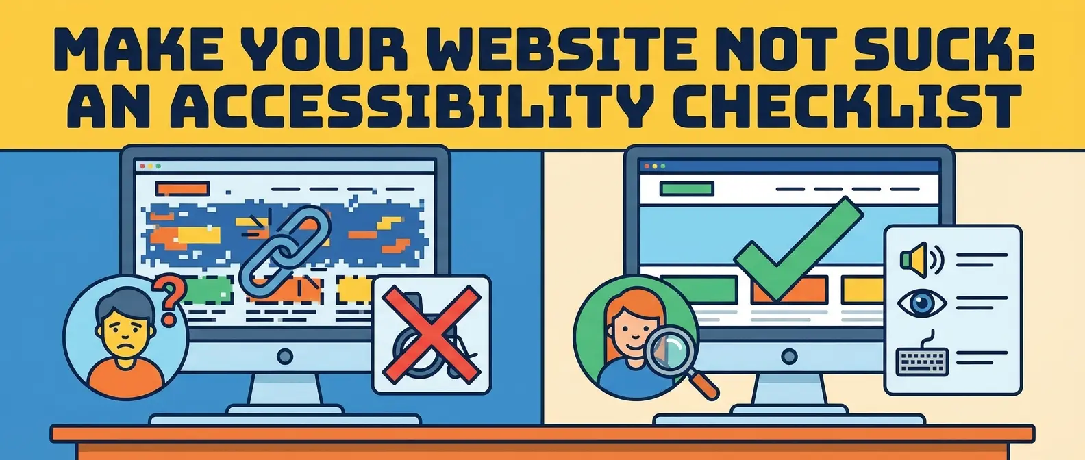
So, let’s get this right. Here is the ultimate web accessibility checklist to ensure your corner of the internet is welcoming to everyone, not just people with perfect vision and the lightning-fast reflexes of a pro gamer.
Principle 1: Is Your Content Perceivable? (The “Can People See & Hear This?” Checklist)
This is the absolute baseline. If people can’t perceive your content, you might as well have a blank page. It’s about making sure information is presented in ways everyone can access.
- Alternative Text for Images: Every meaningful image needs “alt text.” It’s a short description that a screen reader announces. If an image is purely decorative, give it an empty alt attribute (alt=””) so assistive tech knows to skip it. This is non-negotiable.
- Color Contrast is King: Have you ever tried to read light gray text on a slightly-less-light-gray background? It’s a nightmare. Use a contrast checker to ensure your text is readable for people with low vision or color blindness. Seriously, stop hiding text from your users. It’s the digital equivalent of whispering in a rock concert.
- Captions and Transcripts: If you have a video or audio file, you need captions for users who are deaf or hard of hearing. A full transcript is even better, as it also helps people who prefer to read or who are in a noisy environment.
- Don’t Rely on Color Alone: Never use color as the only way to convey information. That “required fields are in red” instruction is useless to a colorblind user. Use an icon, an asterisk, or bold text in addition to the color.
Principle 2: Is Your Website Operable? (The “Can People Actually Use This?” Checklist)
A beautiful website that nobody can navigate is just a very expensive digital painting. Operability means the interface can’t require interaction that a user cannot perform.
- Keyboard Navigation is a Must: Unplug your mouse. Now try to use your website. Can you get everywhere? Can you fill out forms? Can you see where you are (a visible focus state)? If the answer is no, you have work to do. Many users rely on a keyboard or keyboard-like devices to navigate.
- No Keyboard Traps: A keyboard trap is when a user can navigate into a component (like a pop-up modal) but cannot navigate out of it using their keyboard. It’s the digital equivalent of a roach motel. Don’t do it.
- Generous Click Targets: Make your buttons and links large enough to be easily tapped, especially on mobile. Trying to hit a tiny link is frustrating for everyone, but it can be impossible for someone with motor disabilities.
- Provide Enough Time: Don’t have content that disappears or changes too quickly without a way for the user to pause, stop, or extend the time limit. Auto-playing carousels are a prime offender here.
Principle 3: Is Your Content Understandable? (The “Does This Make Any Sense?” Checklist)
You can have a perceivable, operable site that is still a confusing mess. Understandability is about clarity and consistency. This is where your overall design choices can make or break the experience.
- Consistent Navigation: Your main menu shouldn’t play hide-and-seek. Keep navigation elements in the same place across your entire site. Predictability is a user’s best friend.
- Write in Plain Language: Avoid jargon and complex sentences whenever possible. Your goal is to communicate clearly, not to win a thesaurus-of-the-year award.
- Helpful Error Messages: When a user makes a mistake on a form, don’t just say “Error.” Tell them exactly what’s wrong (“Oops, please enter a valid email address”) and how to fix it.
- Design for Clarity: As we barrel through 2026, the battle between different design aesthetics continues. Whether you’re into empty space or rainbow explosions, your core goal should be clarity. Your design trend of choice should support the user’s journey, not create a confusing puzzle.
Principle 4: Is Your Website Robust? (The “Will This Work Tomorrow?” Checklist)
Robustness is about making sure your site works reliably across different browsers, devices, and especially with assistive technologies like screen readers. This is where clean code becomes your superpower.
- Use Valid HTML: Use semantic HTML5 tags like `<nav>`, `<main>`, and `<button>` correctly. This gives assistive technologies the context they need to interpret your page structure.
- Follow WCAG 2.2 Guidelines: The Web Content Accessibility Guidelines (WCAG) are the gold standard. The latest version, 2.2, adds new criteria around focus appearance and accessible authentication. Familiarize yourself with them; they are the foundation for true inclusive web design.
- Test with Assistive Technologies: You can’t know if your site works with a screen reader unless you, well, test it with a screen reader. Tools like NVDA (free) or JAWS can give you a whole new perspective on your own website.
See It In Action
Beyond the Checklist: Aiming for an ADA Compliance Website and More
Ticking boxes on a checklist is a great start, but it’s not the end goal. Achieving an ADA compliance website is the legal minimum in many cases, but true accessibility is a mindset. It’s about building empathy into your process and using accessible UI design patterns from the very beginning of a project, not as an afterthought.
So, take this checklist and use it. Share it. Make the internet a little less frustrating and a lot more human. Your users—all of them—will thank you for it.