The Great Design Smackdown: Minimalism vs. Maximalism in 2026
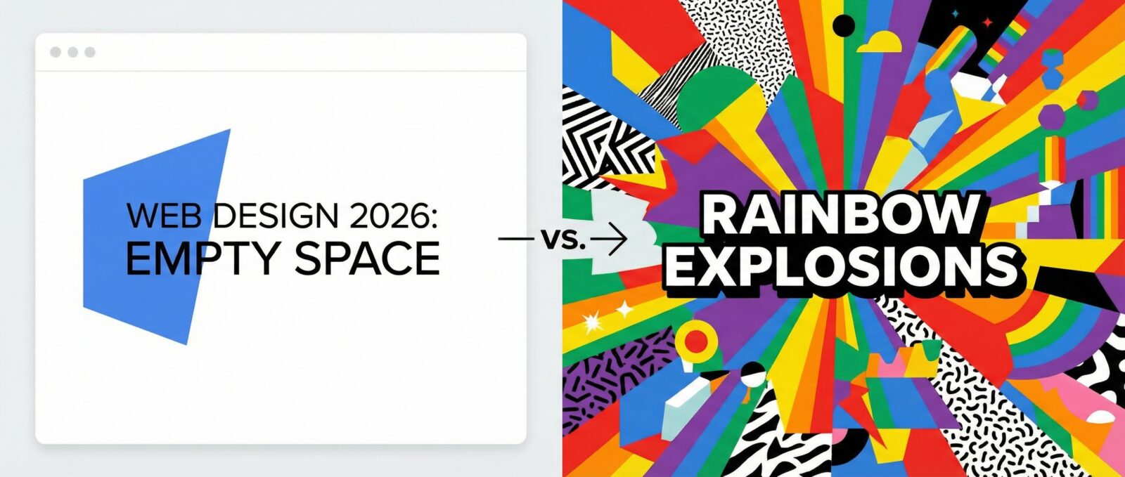
Have you ever visited a website and thought, “Is my internet slow, or is this page just empty?” That is the extreme end of minimalism. On the flip side, have you ever landed on a page that looked like a rainbow exploded inside a text factory? That is maximalism. As we head into 2026, the internet feels like it’s having an identity crisis. We are stuck between wanting zen-like peace and wanting a digital party.
I am here to tell you that you don’t have to pick a side. In fact, if you pick a side too strictly, you might just scare your visitors away. Let’s break down this battle of styles and figure out how to keep your website looking cool without causing a headache.
Team Minimalism: Is This Art or Did the CSS Fail?
Let’s start with the clean freaks. Minimalist web design has been the cool kid in class for a long time. It’s all about white space, neat fonts, and hiding everything that isn’t absolutely necessary. The logic is sound: if there is less clutter, people can focus better.
But let’s be honest, sometimes it goes too far. I have been on minimalist sites where I couldn’t even find the menu button because the designer thought a single pixel dot was “intuitive.” While minimalism makes your site load faster than a cheetah on espresso, it can also feel a bit cold. It’s like walking into a house with no furniture. Sure, it’s clean, but where do I sit?
Why people still love it:
- It loads incredibly fast (great for impatient people like me).
- It looks professional and trustworthy.
- It works great on mobile screens where space is tight.
Team Maximalism: Everything Everywhere All at Once
Now, let’s look at the rebels. Maximalist trends are making a huge comeback, probably because we are all bored of staring at white screens. This style screams, “Look at me!” It uses bold colors, massive fonts, overlapping images, and sometimes weird animations that follow your mouse pointer.
Maximalism is fun. It has personality. It reminds me of the early internet days when we just threw GIFs everywhere because we could. However, there is a fine line between “artistic chaos” and “my eyes hurt.” If you throw too much at your visitors, they won’t know where to look. They might just close the tab to save their sanity.
Why people are obsessed with it:
- It stands out from the sea of boring, similar-looking corporate sites.
- It feels creative and human.
- It creates a memorable experience (for better or worse).
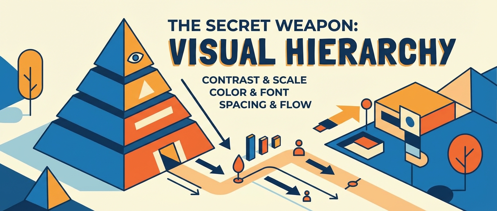
The Secret Weapon: Visual Hierarchy
So, how do we survive 2026 without boring people to sleep or giving them a sensory overload? The answer isn’t about how much stuff you put on the screen; it is about how you organize it. This is where visual hierarchy comes in to save the day.

Think of visual hierarchy as the traffic cop of your website. It tells the user’s eye where to go first, second, and third. You can have a busy, maximalist background, but if your main button is huge and contrasts with the noise, people will still click it.
Conversely, you can have a minimalist site, but if all your text is the same size, nobody will know what is a title and what is a paragraph. Balance is about using size, color, and placement to guide the user, regardless of whether your style is “empty room” or “circus tent.”
Defining Modern Web Aesthetics for 2026
The truth is, the best websites in 2026 are going to be a mashup. We are seeing a trend called “expressive minimalism.” This means keeping the layout clean and usable (minimalist) but using wild fonts, 3D elements, or crazy colors (maximalist) to show off some personality.
Modern web aesthetics aren’t about following a rulebook anymore. They are about vibes. Here is how to nail the balance:
- Use whitespace, but make it active: Don’t just leave empty space; use it to frame a really cool, loud image.
- Go big with type: Use massive, maximalist headlines, but keep the body text clean and readable.
- Micro-interactions: Keep the design simple, but make buttons wiggle or change color when you hover over them. It adds flavor without the clutter.
The Final Verdict
At the end of the day, your website shouldn’t look like a spreadsheet, but it also shouldn’t look like a messy bedroom. The goal for 2026 is to find the sweet spot. Be brave with your design choices, but please, for the love of the internet, make sure I can still find the “Contact Us” button.
