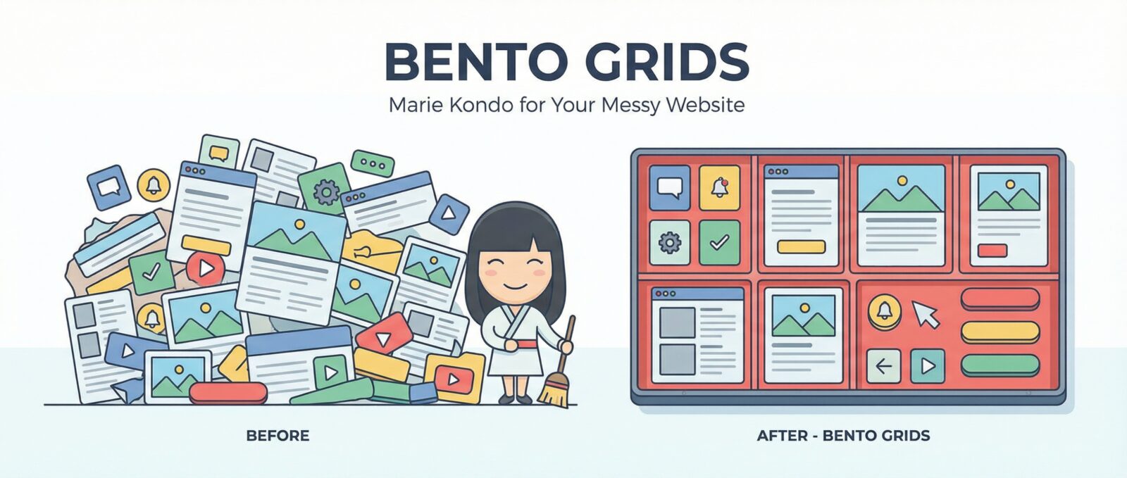
The Bento Grid Revolution: Organizing Content Like Apple
Ever look at a website and feel like you just walked into a teenager’s messy bedroom? There are buttons everywhere, images floating in the void, and text overlapping like it’s trying to start a fight. I’ve been there. It’s stressful. But then, you watch an Apple keynote event, and suddenly, peace washes over you. Everything is in a perfect, rounded rectangle. Everything has a home.
Welcome to the bento grid revolution. It’s the design trend that is finally forcing the internet to clean up its room.
What on Earth is a Bento Grid?
If you’ve ever had a Japanese bento box for lunch, you get the concept immediately. You have a compartment for rice, a spot for the meat, and a tiny little zone for those pickles I pretend to like but secretly don’t. The food doesn’t touch. It’s organized. It’s beautiful.
In web design, a bento grid is a grid layout where content is divided into distinct boxes or cells. Some boxes are big and demand attention (like the main course), and others are small squares for quick info (like the pickles). It divides the screen into a clear hierarchy without looking cluttered.
This is basically the evolution of the card UI we’ve seen for years, but tighter. It’s not just a list of blog posts; it’s a dashboard for your life.
Why Apple (and Everyone Else) Loves It
Apple didn’t invent the grid, but they definitely made it the cool kid in school. When they show off the specs for a new iPhone, they don’t give you a boring list. They slap a camera lens in one box, the processor chip in another, and the battery life in a third. It looks high-tech, yet simple.
Here is why this modular design works so well for us mere mortals building websites:
- It’s Responsive: Dealing with mobile layouts used to make me cry. But with a bento layout, the boxes just stack on top of each other when the screen gets smaller. It’s like Tetris, but you always win.
- It Prioritizes Content: You can make the most important box huge. It forces you to decide what actually matters. If you struggle with this, you might need to read up on how to Stop Hiding Text: A Guide to Not Being a Web Design Jerk.
- It Looks Modern: It just feels futuristic. Especially if you pair it with a sleek color scheme. If you want to make those boxes really pop without blinding your users, you should definitely consider Dark Mode: Because Your Retinas Deserve a Break.
Don’t Just Make Boring Boxes
Okay, I know what you are thinking. “Great, I’ll just draw some squares on the screen and call it a day.” No! Please don’t do that. A grid of static, boring squares is just a spreadsheet.
To make a bento grid actually engaging, the cards need to feel alive. When a user hovers over a box, it should do something. Maybe it zooms in a little, or a button appears. These little details matter. If your grid feels stiff and lifeless, you are failing. You need to learn the lesson: Don’t Be A Digital DMV: Use Micro-Interactions.
Keeping It Fast
The danger of the bento grid is that you might be tempted to fill every single box with a high-resolution video or a massive image. Suddenly, your sleek dashboard takes ten minutes to load.
I love a pretty site, but I love a fast site more. If you overload your grid, Google is going to punish you. You have to keep an eye on your performance metrics. If you don’t know what I’m talking about, go read about Core Web Vitals: Why Google Hates Your Slow Turtle Site.
Wrap It Up
The bento grid isn’t just a trend; it’s a sanity-saving method for organizing the chaos of the web. It treats every piece of content like a valuable object in a display case. So, embrace the modular design. embrace the rounded corners, and for the love of code, keep your pickles away from your rice.
