Stop Doom Scrolling, Start Scrollytelling
Remember the early days of the internet? You clicked a link, a wall of text appeared, and if you were lucky, a pixelated GIF of a dancing baby showed up to break the monotony. We’ve come a long way since then. Today, we have something called scrollytelling. It’s exactly what it sounds like: storytelling that unfolds as you scroll.
It’s the difference between reading a textbook and watching a movie where you control the speed. Instead of just dumping information on a user, you take them on a journey. It’s flashy, it’s engaging, and if done wrong, it can make your laptop sound like a jet engine preparing for takeoff.
What Exactly Is Scrollytelling?
At its core, scrollytelling turns a static web page into a dynamic experience. As the user scrolls down (or sometimes sideways, if you’re feeling chaotic), elements on the screen change. Text fades in, images resize, animations trigger, and data visualizations dance around.
This is the peak of visual storytelling. You aren’t just asking someone to read; you are guiding their eyes and controlling the pacing. It transforms a boring report into an adventure. However, before you go wild, remember that this requires some serious design chops. If you’re still struggling with the basics, you might want to read about art styles and finding the right canvas first.
Why Immersive Design Matters
We live in an attention economy. If your website looks like a tax form, people are going to bounce faster than a kangaroo on an espresso binge. Immersive design hooks the user. It creates a “lean-in” experience.
Think about it. When you scroll through a well-made story, you want to see what happens next. The background changes color to match the mood. The text floats up just as you need to read it. It feels alive. It’s a great way to break away from standard layouts. While I love a good organized layout, sometimes you need more than Bento Grids to Marie Kondo your website; sometimes you need a narrative flow.
See It In Action
The Mechanics: Scroll Interactions
So, how does the magic happen? It’s all about scroll interactions. These are triggers set in the code that tell the browser, “Hey, when the user gets 500 pixels down the page, make that picture of the cat explode into confetti.”
To pull this off, you need a mix of HTML, CSS, and usually some JavaScript libraries like GSAP or ScrollMagic. If the idea of touching code makes you sweat, check out my thoughts on how to code in 2025 without crying. Trust me, it helps.
But here is the kicker: these interactions need to be smooth. If they are clunky, it feels like you’re fighting the website. It’s similar to the importance of micro-interactions in apps. You don’t want your site to feel bureaucratic and stiff. As I’ve said before, don’t be a digital DMV; use micro-interactions to keep things delightful.
The “Please Don’t Crash My Browser” Warning
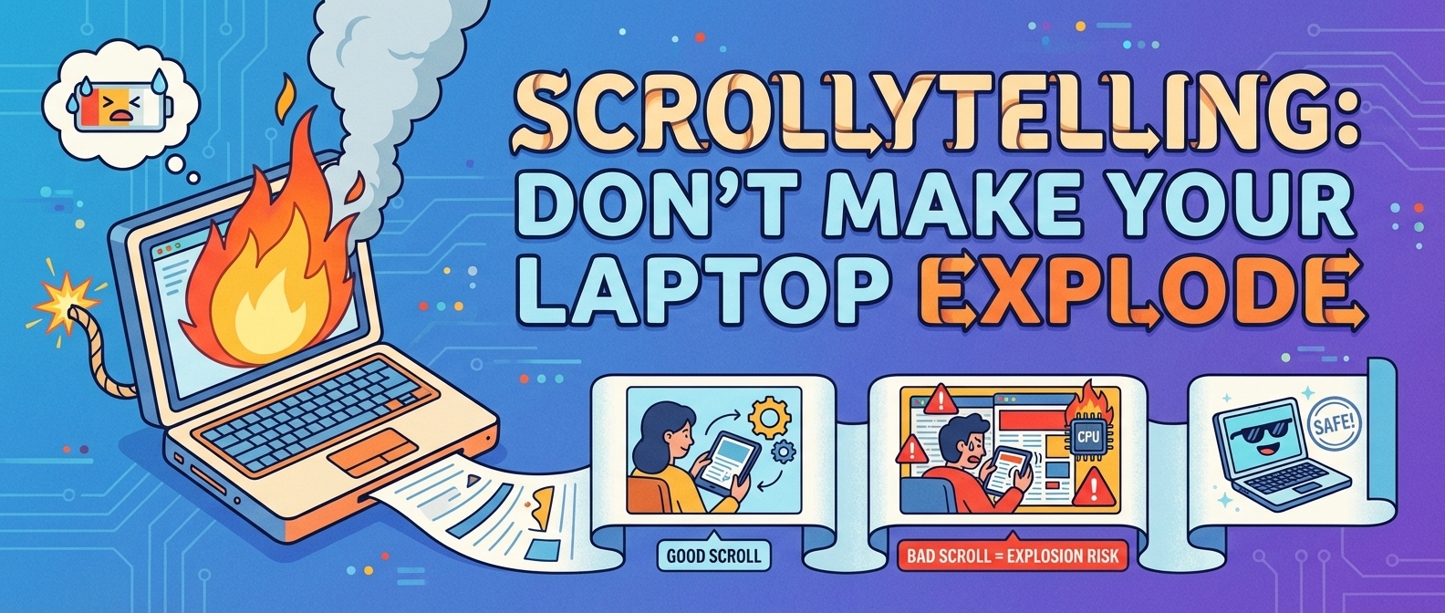
Here is the part where I have to be the buzzkill parent. Scrollytelling is heavy. High-resolution images, video backgrounds, and complex scripts can murder a site’s performance. If your fancy storytelling page takes ten seconds to load, nobody is going to see your masterpiece.
Google cares about this stuff. A lot. If you overload the DOM, you are going to hurt your Core Web Vitals. You need to optimize everything. If you ignore performance, you might want to read up on why Google hates your slow turtle site. Seriously, don’t let your artistic vision destroy your load times.
Also, if you are running this on a CMS, you need to ensure the backend can handle it. You might need to kick your slow WordPress site’s butt into gear before adding a thousand parallax effects.
Design Tips for the Non-Artist
You don’t need to be Da Vinci to make this work, but you do need assets. You need graphics that can be layered and separated to create depth. If drawing isn’t your thing, stop pushing pixels manually. We have technology for that now. AI design tools are great because moving rectangles sucks.
Also, pay attention to your typography. Since scrollytelling often relies on big, bold statements, your choice of font is critical. If you are still using the default system fonts, we need to talk. Your font folder is probably bloated and sad, but picking the right typeface can make or break the immersion.
Accessibility: The Elephant in the Room
I love a good scroll animation, but you know who hates them? Screen readers and people with motion sickness. When you create these experiences, you cannot leave people behind.
- Provide controls: Let users pause animations.
- Don’t trap the scroll: Never hijack the user’s scroll bar so they can’t move. That is evil.
- Readable Text: Ensure your fancy fading text has enough contrast.
Basic usability still applies. Just because it moves doesn’t mean you can ignore the rules. Stop hiding text and don’t be a web design jerk.
The Future of Scrolling
Is scrollytelling a fad? I don’t think so. As screens get better and our attention spans get worse, we need more engaging ways to consume content. We are moving toward a web that looks less like a newspaper and more like a video game. It aligns pretty well with web design trends for 2026, where we battle between empty space and rainbow explosions.
So, go ahead. embrace the scroll. Create something that makes people stop and stare. Just make sure it loads before they fall asleep.
