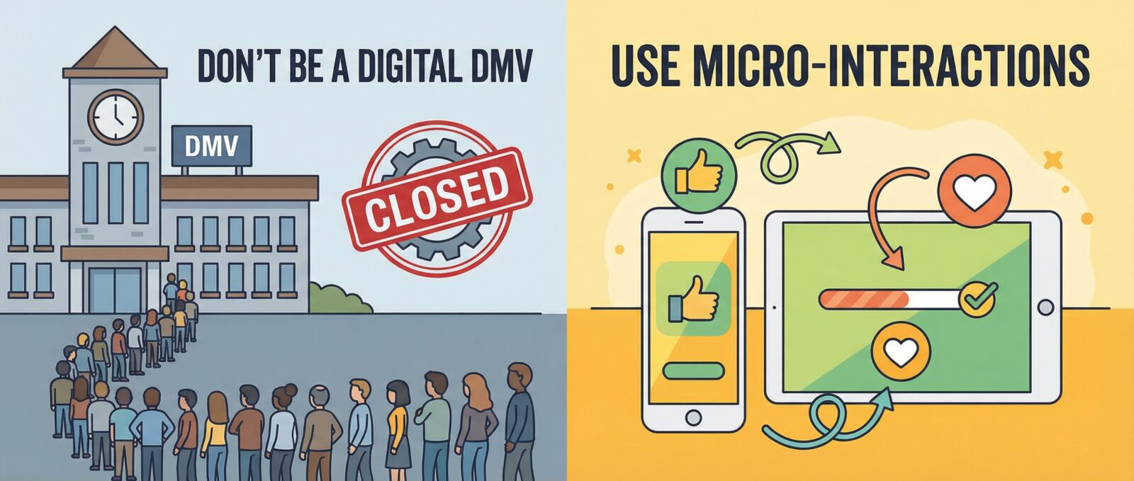
The Secret Sauce Your Website Is Missing (And It’s Not More Java)
Paul Peery here. I’m currently on my third cup of dark roast, and I’ve got a bone to pick with boring websites. You know the ones. You click a button, and… nothing happens. Did it work? Did the internet break? Did I just accidentally order 500 units of something I don’t need?
If your website feels like a digital DMV waiting room, we need to talk. We need to talk about micro-interactions.
These aren’t just fancy bells and whistles. They are the subtle, shiny new things that make the web bearable. And if you use them right, they keep people around long enough to actually buy what you’re selling.
What in the World Are Micro-Interactions?
Think about the last time you “liked” something on social media. That satisfying little heart pop? That’s a micro-interaction. It’s a tiny moment where the device acknowledges you exist.
In the world of ux design (User Experience, for the uninitiated), these little details are everything. They are the difference between a polite handshake and a dead fish. They tell the user:
- “Yes, I heard you.”
- “Hold on, I’m thinking (loading).”
- “Oops, you messed that up.”
- “Look over here!”
Why You Should Care (Besides Looking Cool)
I love cool tech, but I love efficient tech even more. Why spend time coding these little animations? Because they boost user engagement like crazy.
Humans are simple creatures. We like feedback. When we flip a light switch, we want the light to turn on immediately. When we toggle a setting on your app, we want to see that slider move smoothly from “Off” to “On.”
If your site feels dead, people leave. If it feels alive and responsive, they stay. And in my experience with both WordPress sites and the stock market, people who stick around are the ones who eventually pull out their wallets.
How to Use Them Without Being Annoying
Now, don’t go crazy. We have all seen those websites from the early 2000s that flashed like a disco ball. Interactive web elements should be helpful, not headache-inducing.
Here is my quick guide to doing it right:
- Hover Effects: Make your buttons change color or lift up slightly when a mouse hovers over them. It screams, “I am clickable!”
- Loading Animations: If I have to wait for data, give me a spinning wheel or a progress bar. It keeps my brain occupied so I don’t get bored and close the tab.
- Form Validation: If I type my email wrong, show me a little red shake or a polite error message right away. Don’t wait until I hit submit to tell me I failed.
The Bottom Line
You don’t need to be a coding wizard to implement this stuff. Most modern page builders have these settings baked right in. It’s a small tweak that makes your side hustle look like a Fortune 500 company.
So, go sprinkle some animation dust on your site. Make those buttons bounce. Make those toggles slide. Just make sure it serves a purpose. Now, if you’ll excuse me, my coffee pot just made that little “I’m done” beep—my favorite micro-interaction of the day.
