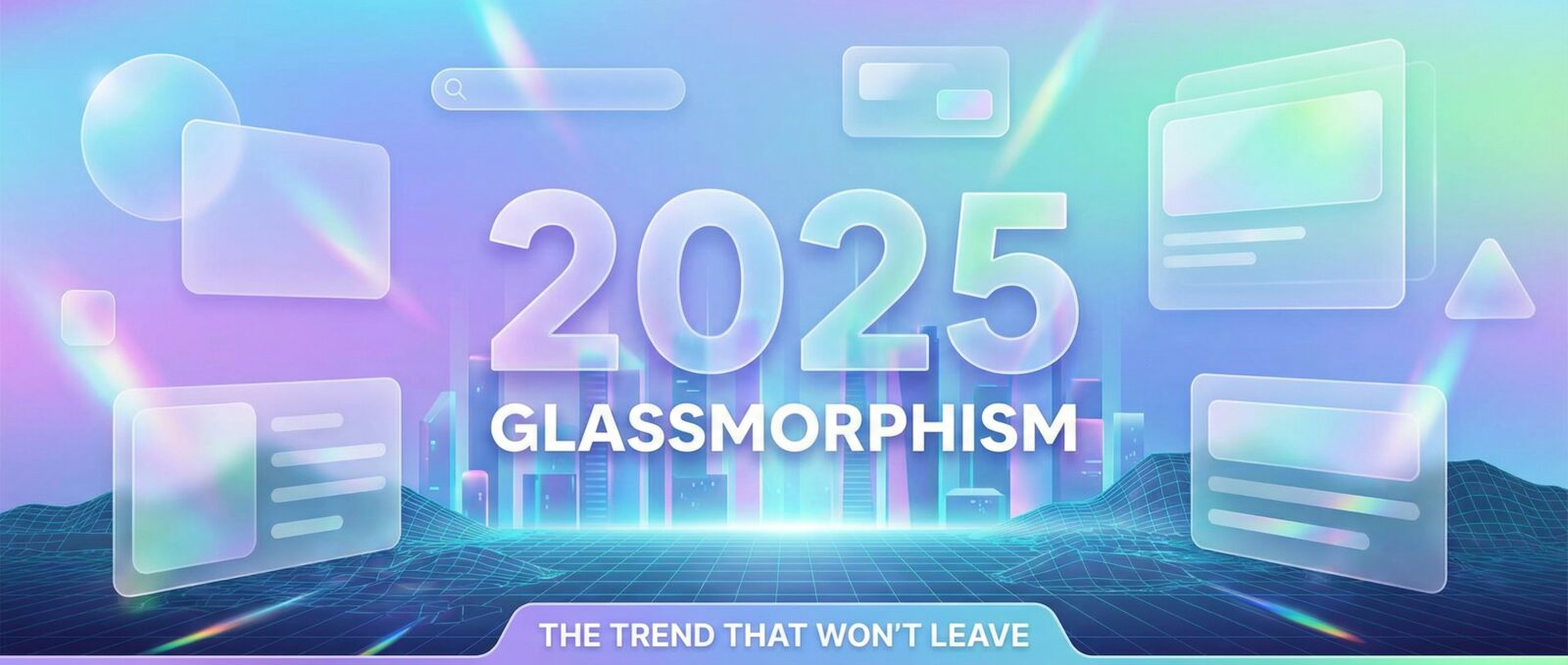
Remember When We Thought Glassmorphism Was a Phase?
I’ll be honest with you. Back in 2021, I thought glassmorphism was going to disappear faster than my motivation to go to the gym. It felt like a gimmick. But here we are in 2025, and this translucent trend is still hanging around. It is like that one guest at a party who doesn’t know when to leave, except now they are actually helping clean up the kitchen.
The evolution of glassmorphism has been fascinating. It went from making interfaces look like a blurry mess to becoming a staple of modern ui trends. It grew up, got a job, and started paying taxes. Let’s look at how this style has changed and why your screen still looks like a fancy shower door.
It’s Not Just About Blurry Rectangles Anymore
The classic frosted glass effect used to be slapped onto everything. It made websites look like Windows Vista had a baby with an iPhone. Today, designers are smarter. We aren’t just blurring backgrounds for the sake of it. We use it to create depth and hierarchy.
One of the best ways I’ve seen this used recently is inside grid layouts. By combining the glass look with structured boxes, you get a clean, organized aesthetic. Speaking of organization, if your layout is currently a disaster, you really should read about Bento Grids: Marie Kondo for Your Messy Website. When you mix glass textures with bento boxes, your UI looks structured yet airy.
The Tech Behind the Blur
Let’s talk code for a second. The CSS backdrop-filter property is the magic wand that makes this possible. In the past, using this property too much was a great way to turn a user’s phone into a portable heater. Browsers struggled to render all those blurs in real-time.
In 2025, devices are faster, but that doesn’t mean you should go crazy. You need to care about performance. If you add too many effects, you are just hurting the planet. Seriously, go read Stop Killing Polar Bears With Your Bloated Website. If your glass effect lags, nobody cares how pretty it is. If you are running a heavy CMS, you might want to Kick Your Slow WordPress Site’s Butt into Gear before adding fifty layers of heavy CSS filters.
See It In Action
The Dark Side of Glass
Glassmorphism truly shines—or rather, glows—in the dark. Light mode glass can sometimes look like a dirty window. But dark mode? That is where the magic happens. It gives that futuristic, sci-fi vibe we all crave. It separates layers without using harsh borders.
If you haven’t implemented a night theme yet, you are behind the curve. Check out Dark Mode: Because Your Retinas Deserve a Break. However, a word of warning: placing text on top of a semi-transparent, blurry background can be a nightmare for readability. You don’t want to make your content impossible to read. Stop Hiding Text: A Guide to Not Being a Web Design Jerk is mandatory reading if you plan on putting thin white text on a blurry light-gray background.
Who Is Actually Designing This Stuff?
I spend half my time wondering if I should just let a robot do my job. With the rise of AI Web Design Trends for 2025, generating these complex glass textures is easier than ever. You don’t have to fiddle with sliders in Photoshop for hours to get the right level of opacity.
You can actually use AI Design Tools: Because Moving Rectangles Sucks to generate the CSS code or the image assets for you. It saves time, which you can spend crying over JavaScript errors or reading How to Code in 2025 Without Crying.
The Verdict
Glassmorphism in 2025 is refined, performant, and less annoying than before. It creates depth without screaming for attention. Just use it sparingly. Treat the frosted glass effect like hot sauce. A little bit makes everything exciting; too much will ruin your day and make your eyes water.
