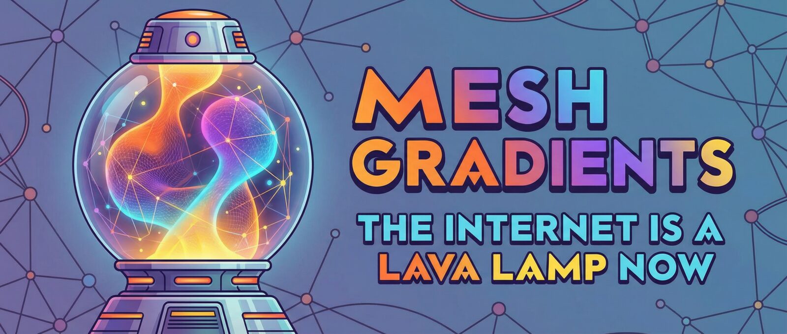
The Internet is a Lava Lamp Now: Embracing Mesh Gradients
Remember a few years ago when the entire internet decided to dress up like a minimalistic hospital room? Everything was stark white, light gray, or—if we were feeling really wild—a slightly darker shade of gray. It was clean, sure, but let’s be real: it was a total snooze fest. I half-expected a nurse to walk out of my laptop screen and hand me a lollipop for being a brave user.
Well, grab your sunglasses, folks, because the party is back. We are officially in the era of mesh gradients, and my retinas have never been happier.
Wait, What Are Mesh Gradients?
If you aren’t a design nerd like me, you might be scratching your head. Think of a gradient. You know, like those old PowerPoint slides that faded from blue to green in a straight line? Okay, now take that boring line, throw it in a blender with some neon fruit juice, and hit “puree.”
Mesh gradients are these dreamy, multi-colored blurs where colors flow into each other from all different directions. They don’t follow rules. They look like floating clouds of cotton candy or that weird, pretty oil slick you see in a parking lot puddle (but, you know, sanitary). They are fluid, organic, and strangely hypnotic.
See It In Action
Why We Were Desperate for Color
For the longest time, being “modern” meant being boring. We called it “minimalism,” but it was mostly just a lack of imagination. But humans like shiny, colorful things. It’s in our DNA. We can only look at black text on a white background for so long before our brains start to melt.
The current color trends are a direct rebellion against the “Sad Beige” era. We want vibrancy! We want energy! We want websites that look like they just chugged an energy drink. This shift isn’t just about being loud; it’s about feeling something. Color makes us feel emotions, whereas white space mostly just makes us feel like we forgot to load the page.
Where You’ve Seen Them (Probably Everywhere)
If you have updated an app or visited a tech website in the last six months, you have seen these bad boys. They are the kings of modern ui backgrounds. Companies use them to make their boring software look like it’s from the future.
Here is where they usually pop up:
- Behind the Hero Text: That big headline at the top of a website? It usually has a fuzzy, colorful blob floating behind it now.
- App Icons: Even our phone screens are getting a glow-up. Flat colors are out; 3D-looking color blends are in.
- Cards and Buttons: Why click a gray rectangle when you can click a glowing sunset?
It’s All About the Vibes
So, why do I love them so much? It really comes down to visual aesthetics. Mesh gradients manage to be two things at once: futuristic and nostalgic. They remind me of the 90s and Y2K era when everything was bright and optimistic, but they are polished enough for 2024.
They add depth to a flat screen. When you look at a mesh gradient, it feels like there is a world inside your screen, swirling around. It makes digital spaces feel alive and breathing, rather than static and dead.
Final Thoughts: Embrace the Rainbow
If you are still holding onto your monochrome designs, I am begging you: let it go. Add a splash of purple. Mix in some teal. Let them blur together until you aren’t sure where one ends and the other begins.
Mesh gradients are fun, they are fresh, and they save us from the boredom of the white void. The internet is supposed to be a fun place, so let’s make it look like one again.
