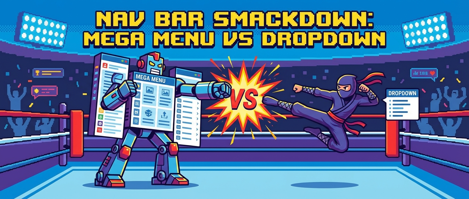
Mega Menus vs. Dropdowns: A Digital Cage Match for Your Clicks
Have you ever played that thrilling game called “Where on Earth is the ‘Contact Us’ Page?” You hover over one menu item, and a list of links drops down. But the one you need isn’t there. So you move to the next, and another list appears. You’re carefully moving your mouse like you’re defusing a bomb, because if you move a single pixel in the wrong direction, the whole thing vanishes. This is the classic dropdown experience. It’s the digital equivalent of a filing cabinet with too many folders.
On the other side of the ring, we have its bigger, flashier cousin: the mega menu. This is the all-you-can-eat buffet of website navigation. You hover over one link, and a giant panel opens up, displaying every possible option, sometimes with pictures and icons. It’s the maximalist “rainbow explosion” of links we talked about in our guide to 2026 design trends, and it can be either a godsend or a total nightmare.
So, who wins this battle for your navigation bar? Let’s break down the contenders.
See It In Action
The Traditional Dropdown: The Quiet Minimalist
A standard dropdown menu is a vertical list of links that appears when you hover over or click a top-level navigation item. It’s clean, simple, and has been a web staple since the internet was powered by dial-up and collective hope.
- Pros: It’s tidy and takes up very little space. For a website with a straightforward structure (like a blog or a simple portfolio), it’s perfect. It doesn’t overwhelm the user with choices, which is great for our lazy brains, a concept we dive into in UX Psychology: Designing For Lazy Brains.
- Cons: It hides your website’s structure. Users have to hunt and peck to see what’s available, which is terrible for discoverability. If you have more than a handful of sub-items, it can become a comically long list that requires scrolling—a huge user experience foul.
The Mega Menu: The Glorious Information Dump
A mega menu is a large, expandable panel that drops down from a navigation bar. Instead of a single column, it uses multiple columns, headings, and sometimes even images and icons to display a wide range of options at once. It’s like using a Bento Grid to organize your navigation.
- Pros: Everything is visible at a glance. This is fantastic for large e-commerce sites or complex service websites. You can visually group related items, making the entire information architecture clear. A well-designed mega menu can dramatically improve the user flow by reducing the number of clicks needed to get somewhere important.
- Cons: They can be overwhelming. A poorly organized mega menu is just a wall of links that can cause decision paralysis. They also take up a huge chunk of screen real estate and, if not designed carefully, can be an absolute disaster on mobile devices.
So, Which One Should You Use?
The choice between a mega menu and a dropdown isn’t about which is trendier; it’s about your website’s specific needs. It all comes down to your information architecture—the blueprint of your site.
Use a traditional dropdown if:
- You have 7 or fewer top-level navigation items.
- Your categories have a simple, linear hierarchy (e.g., Services > Service A, Service B).
- You’re aiming for a minimalist aesthetic where content discovery is less critical than a clean interface.
Use a mega menu if:
- You run a large e-commerce store with many product categories and sub-categories.
- You have a content-heavy site, like a news portal or a large corporate website.
- You want to use icons or images to make your navigation more visual and intuitive.
- Your user flow requires quick access to pages deep within the site structure.
The Mobile Minefield: Please, Don’t Break My Thumbs
Here’s where things get spicy. A giant, sprawling mega menu on a desktop can be great. But on a phone? It’s a usability catastrophe. As I screamed about in my Mobile UX Guide, if I can’t reach it easily with my thumb, I’m not tapping it.
You cannot simply shrink a desktop mega menu for mobile. It has to be completely rethought. Often, the best solution is to convert it into a multi-level accordion menu that users can tap to expand. The key is to present the information in digestible chunks, not a giant wall of text that requires precision thumb-tapping.
A good website navigation system is the first step in creating a smooth journey for your users, much like the opening scene in a good scrollytelling experience. Choosing between a mega menu and a dropdown is a foundational decision. Get it right, and you provide a clear map for your users. Get it wrong, and you’ve basically handed them a broken compass and wished them luck.
