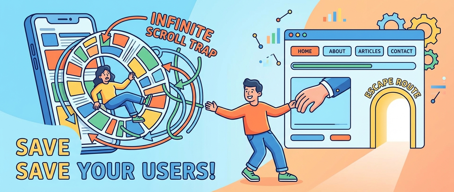
We’ve all been there. It’s 1 AM. You tell yourself, “Just one more post.” Suddenly, the sun is rising, your thumb has developed a mind of its own, and you have no idea how you ended up watching a compilation of dogs failing to catch frisbees. You, my friend, have fallen victim to the infinite scroll.
It’s the siren song of modern web design, promising a seamless, never-ending river of content. In reality, it’s often a UX nightmare that leaves users feeling lost, overwhelmed, and unable to find that one thing they actually wanted to see. It’s one of the most common bad ux patterns out there, and it’s time we talked about the damage it’s doing.
The Bottomless Pit of Despair (and Content)
I get the appeal. On platforms like Instagram or TikTok, the goal is to keep you engaged for as long as possible. The less you have to click, the more you’ll scroll. But when this logic is applied to e-commerce sites, blogs, or search results, things fall apart fast. Here’s why your infinite scroll is actually a user-hostile feature.
1. The Elusive Footer: A Digital Ghost
Have you ever tried to click on a “Contact Us” or “About Us” link in a website’s footer, only for more products to magically appear and push it just out of reach? It’s like a cruel game of digital whack-a-mole. The footer contains vital information—sitemaps, privacy policies, contact details—and making it impossible to access is a cardinal sin of infinite scroll ux. Users shouldn’t have to race the loading screen to find your phone number.
2. My Brain is Full, Please Stop
Our brains are not designed to process an endless stream of information without a break. It’s exhausting! When you eliminate the natural stopping points provided by pages, you remove the user’s ability to pause and process. As I’ve said before, you should be designing for lazy brains, not trying to short-circuit them. This continuous flow leads to decision fatigue and makes it harder for users to remember where they saw something, turning a simple browsing session into a cognitive marathon.
3. The Performance Hog
Every cat photo, every product listing, every meme that loads has to come from somewhere. As a user scrolls deeper and deeper, their browser is working overtime to fetch and render new content, ballooning the page’s memory usage. This can lead to sluggishness, janky scrolling, and a frustrated user. It’s the opposite of a good scrollytelling experience; instead of a smooth journey, you get a sputtering engine that threatens to overheat their device.
4. “I Swear It Was Right Here!” Syndrome
Infinite scroll destroys a user’s sense of place. How do you bookmark your position? How do you share a link to the specific set of results you’re looking at? How do you go back to that one perfect item you scrolled past 20 minutes ago? You can’t. With no page numbers or stable URLs for your location in the feed, navigation becomes impossible. It’s a one-way trip down a content rabbit hole with no easy way back.
Pagination vs Infinite Scroll: The Main Event
So, is infinite scroll always the villain? Not quite. The key is context. In the great pagination vs infinite scroll debate, it all comes down to the user’s goal.
- Choose Infinite Scroll for Discovery: If your content is a visual feed where users are just browsing for entertainment (think Pinterest or a social media feed), it can work. The goal is exploration, not finding a specific item.
- Choose Pagination for Goal-Oriented Tasks: If a user is shopping for a specific pair of shoes, comparing search results, or looking through a forum, they need control. They need to know there are 10 pages of results, and the item they liked was on page 3. Pagination provides that essential structure and sense of control.
There is a Better Way: The “Load More” Button
If you’re looking for a happy medium, the “Load More” button is your new best friend. It’s the perfect compromise. It breaks up the content into manageable chunks but doesn’t force a full page reload like traditional pagination. Most importantly, it puts the control back where it belongs: with the user.
This simple click is a perfect example of how small micro-interactions can vastly improve an experience. This is especially crucial on mobile, where every tap matters. Giving users control prevents them from scrolling into oblivion and saves their thumbs from exhaustion, a key part of any good mobile UX guide. Sometimes, the solution isn’t a better scroll but better organization from the start, like using Bento Grids to present information clearly.
Stop the Never-Ending Scroll
Let’s be clear: infinite scroll isn’t inherently evil, but it’s a powerful tool that’s often misused, landing it squarely in the category of bad ux patterns. By removing user control, hiding important navigation, and overwhelming our brains, it often creates more problems than it solves. Next time you’re designing a feed, ask yourself: are we helping the user or just trapping them? Give them back the control. Give them a footer. For the love of all that is holy, give them an end.
