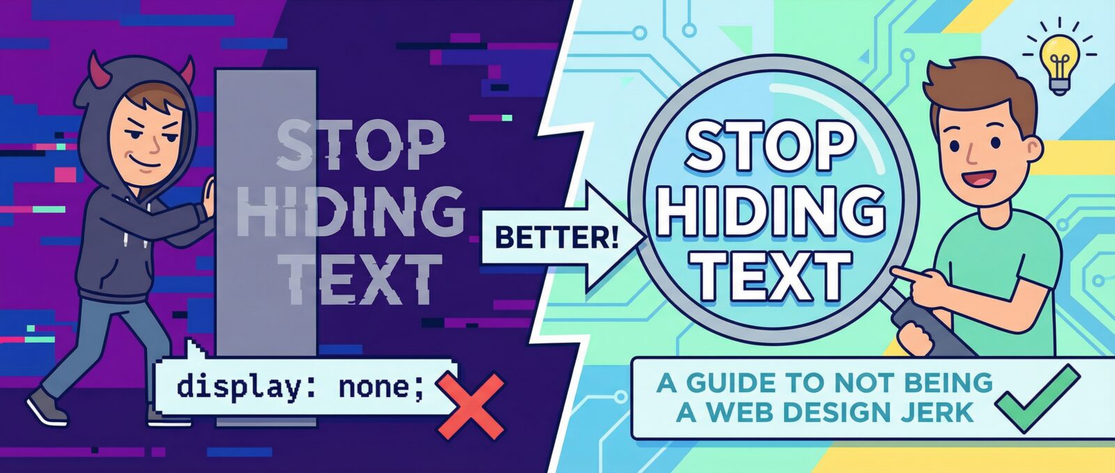
Let’s Talk About Not Being a Jerk on the Internet
Let’s be real for a second. Have you ever visited a website where the text was a light whisper of gray on a white background? You probably squinted so hard you gave yourself a headache, right? Now, imagine navigating that same site if you had visual impairments, or trying to click a tiny button with a shaky hand.
This is where web accessibility comes in. It’s not just about following rules; it’s about not building digital barriers that lock people out. Think of it as inclusive design—creating a space where everyone is invited to the party, not just the people with perfect 20/20 vision and a high-end gaming mouse.
Why Should You Care? (Besides Being a Decent Human)
Okay, if the moral argument doesn’t grab you, let’s talk about the scary stuff: lawsuits. ADA compliance (Americans with Disabilities Act) is a real thing. If your website isn’t accessible, you could legally be in hot water. It’s like building a shop with stairs but no ramp; you’re basically telling a whole group of customers, “Nope, not for you.”
Plus, accessible sites generally rank better in search engines. So, if you are on My SEO Quest: Taming Google’s Robot Overlords, making your site friendly for humans makes it friendly for robots, too.
The Color Contrast Struggle
Designers love aesthetics. I get it. But sometimes, art gets in the way of utility. You might think that subtle pastel palette looks dreamy, but if nobody can read it, it’s useless. We need high contrast.
We’ve talked about saving your eyes before in Dark Mode: Because Your Retinas Deserve a Break. But remember, just because the background is dark doesn’t mean your text should be dark gray. Text needs to pop! Also, don’t rely on color alone to convey information. If your error message is just a red outline, colorblind users might miss it entirely. Use text labels, people!
Navigating Without a Mouse
Here is a fun test: unplug your mouse. Now, try to use your website. Can you tab through the menu? can you “click” buttons using the Enter key?
If you get stuck in a form field or can’t access the footer, your site is failing the keyboard accessibility test. This is crucial for users with motor disabilities. It’s also a key part of modern development. If you want to know How to Code in 2025 Without Crying, start by writing semantic HTML that works with keyboards by default.
Don’t Be A Digital DMV: Feedback Matters
When a user clicks a button, something should happen immediately. Screen readers need to know that a form was submitted or a menu opened. If your site just sits there silently loading, everyone gets confused.
We actually covered this in Don’t Be A Digital DMV: Use Micro-Interactions. Small animations or status updates tell users, “Hey, I heard you, and I’m working on it.” Just make sure your animations aren’t flashing like a disco strobe, which can trigger seizures. Keep it smooth, not chaotic.
Speed is an Accessibility Feature
Believe it or not, a slow website is an accessibility issue. If someone is using older hardware or has a slow internet connection, a bloated site is unusable. Google knows this, which is why we talk about Core Web Vitals: Why Google Hates Your Slow Turtle Site.
If your site takes ten seconds to load a hero image, you’ve already lost them. You need to optimize. If you are running a CMS, check out how to Kick Your Slow WordPress Site’s Butt into Gear. A fast site is an inclusive site.
Keep It Simple, Smarty
Complex layouts are a nightmare for screen readers. While AI might be taking over some creative tasks (check out Fired by a Laptop: AI Web Design Trends for 2025 for more on that), humans still need clarity.
Future trends are moving toward cleanliness. As we discussed in Web Design 2026: Empty Space vs. Rainbow Explosions, decluttering your design helps everyone focus. Use headings properly (H1, H2, H3) to create a logical structure. Don’t skip levels just because you like the font size of an H4 better than an H2. That’s cheating.
Your Quick WCAG Checklist
Ready to make your site better? Here is a simplified wcag checklist to get you started:
- Alt Text: Do all your images have descriptions? (Screen readers can’t “see” a picture of a cat, you have to tell them it’s a cat).
- Contrast Ratio: Is your text readable against the background? Aim for a ratio of at least 4.5:1.
- Keyboard Friendly: Can you tab through the whole site without a mouse?
- Captions: Do your videos have subtitles?
- Forms: Do your input fields have actual labels? (Placeholders disappear when you type, labels stay forever).
- No Flashing: Avoid content that flashes more than three times per second.
Final Thoughts
Web accessibility isn’t a burden; it’s an opportunity to reach more people. Whether you are worried about ADA compliance or just want to be a nice person, making your site inclusive is the right move.
So, go fix your contrast, tag your images, and speed up your code. Your users (and your lawyer) will thank you.
