Let’s Be Real About Accessibility
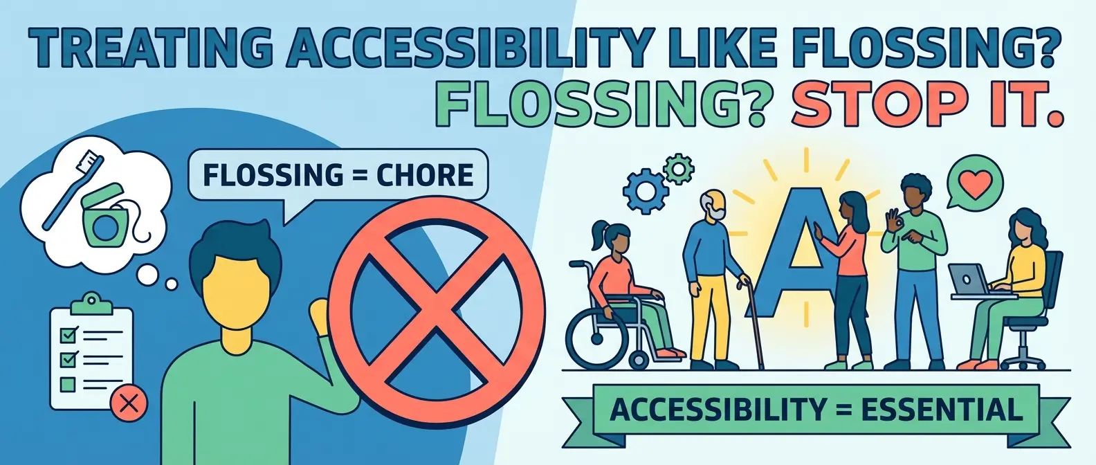
Most developers treat web accessibility like flossing. You know you should do it. You know it’s good for you. But let’s be honest, you probably only panic about it right before an audit or when a lawyer sends a nasty letter. That’s a mistake. We need to stop looking at accessibility as a chore or a checklist item to clear so legal gets off our backs. It is simply about quality code. If you build a chair that collapses when someone sits on it, you built a bad chair. If you build a website that creates digital barriers for 20% of the population, you built a bad website.
We are going to cut through the noise. No fluff, no “empathy exercises,” just the cold, hard facts on how to get your site up to spec without losing your mind.
What is WCAG 2.2 and Why Should You Care?
The Web Content Accessibility Guidelines (WCAG) are the bible for this stuff. We are currently looking at version 2.2. If you are still referencing 2.0, you are living in the past. The wcag guidelines exist to ensure your site is perceivable, operable, understandable, and robust. That sounds fancy, but it just means your site shouldn’t be a puzzle.
WCAG 2.2 introduced new criteria specifically targeting users with cognitive disabilities and those using mobile devices. It’s not enough to just make things work for screen readers anymore. You have to consider focus appearance (can I see where I am tabbing?) and dragging movements. If your drag-and-drop interface requires the precision of a brain surgeon, you are failing.
The “Inclusive Design” Myth
People throw around the term inclusive design like it’s a magical cure-all. It isn’t magic. It’s just logic. It means building things that don’t assume every user has perfect vision, a mouse, and a fiber-optic connection. In fact, if you code properly for accessibility, you usually end up with cleaner, faster code. Conversely, if you build a bloated website full of heavy scripts and unsemantic garbage, you aren’t just hurting the planet; you’re likely crashing the assistive technology your users rely on.
The Big Offenders (And How to Fix Them)
You don’t need to memorize the entire spec immediately. But you do need to stop making these rookie mistakes. If you fix these, you are already ahead of half the internet.
1. Contrast is King
I don’t know who started the trend of light gray text on a slightly lighter gray background, but they should be banned from the internet. It looks sleek on a designer’s 4k retina display in a dark room. It looks invisible to everyone else. If your users have to squint, you failed. We need to quit creating text that was a light whisper of gray and actually let people read the content. Use a contrast checker. Aim for AA compliance at a minimum.
2. The Keyboard Trap
Throw your mouse in the trash for ten minutes. Can you use your website? If you can’t navigate your menus, close your modals, or submit your forms using only the `Tab` and `Enter` keys, your site is broken. This is a huge part of ada standards compliance. Don’t remove the focus outline because it “ruins the aesthetic.” The focus outline is the only way keyboard users know where they are. Removing it is like taking down street signs because they clash with the trees.
3. Mobile Nightmares
Your desktop site might pass the test, but what happens on a phone? WCAG 2.2 has specific rules about target sizes. Buttons need to be big enough to tap without accidentally hitting the link next to them. If a user can’t reach it with my thumb or tap it without zooming in, it’s a fail. We are designing for fat thumbs and shaky hands, not stylus-wielding robots.
4. Cognitive Load
Stop making things complicated. Users don’t read; they scan. If your layout shifts unexpectedly or your navigation is a maze, you are exhausting your user’s brain battery. This aligns perfectly with basic ux psychology. We are lazy. We want the path of least resistance. Accessible content is clear, concise, and predictable.
How to Actually Do This
You can’t fix everything overnight. But you can stop the bleeding. Start by running automated tools like Lighthouse or AXE. They catch about 30% of the easy errors. The rest requires manual testing. Use a screen reader. navigate with a keyboard. Zoom your browser to 200% and see if your layout explodes.
If you need a roadmap, don’t guess. Use a proper accessibility checklist to keep yourself honest. Web accessibility isn’t about being a saint. It’s about being a competent professional. The internet is messy enough; let’s not make it harder to use.