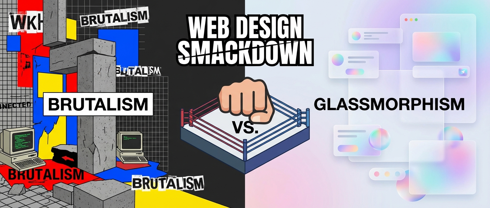
Web Design’s Big Showdown: The Punk vs. The Futurist
Let’s be honest, the internet is having a personality crisis. One minute you’re on a website that looks like it was built in 1999 on a sugar rush, and the next you’re on a page so sleek and transparent you’re worried you’ll leave fingerprints on your screen. It’s a full-on aesthetic battle, a digital smackdown between wildly different ideas of what looks good. As we hurtle towards 2026, two contenders have stepped into the ring: Neo-Brutalism and Glassmorphism. This is more than just a style choice; it’s a philosophical divide between empty space and rainbow explosions.
So, grab your popcorn. In this corner, we have the raw, unapologetic energy of Neo-Brutalism. And in the other, the slick, futuristic elegance of Glassmorphism. Who will reign supreme? Let’s break it down.
Meet the Contender: Neo-Brutalism, The Loud One
Imagine your website stayed up all night listening to punk rock and drinking cheap coffee. That’s Neo-Brutalism. It’s loud, it’s raw, and it couldn’t care less about your delicate sensibilities. This style is a direct rebellion against the safe, clean, and often boring corporate look that has dominated the web for years. It’s what I like to call web design’s angsty teen phase, and frankly, I’m here for it.
The core of neo-brutalism web design is honesty. It shows you the building blocks of the website without trying to hide them. Think of it as a deconstructed burrito bowl—all the ingredients are there, just not neatly wrapped up.
- The Look: High-contrast colors that clash on purpose, stark black outlines on everything, default computer fonts, and shadows so harsh they look like they were drawn with a Sharpie.
- The Vibe: Confident, rebellious, and brutally functional. It values clarity over prettiness.
- Who Uses It: Edgy startups, creative portfolios, and brands that want to scream, “We are not another boring tech company!”
Meet the Challenger: Glassmorphism, The Smooth Operator
Now, let’s turn our attention to the other side of the ring. If Neo-Brutalism is a punk concert, Glassmorphism is a cocktail party on a spaceship. It’s all about creating a sense of depth and translucency, making it look like your UI elements are floating on frosted glass. It’s the trend we all thought was a phase, but it just won’t leave, and has only gotten more refined.
A well-executed glassmorphism ui feels light, airy, and incredibly modern. It guides the user’s eye with subtle cues, using blur and transparency to establish a clear visual hierarchy.
- The Look: Frosted-glass-like backgrounds, multi-layered elements with blurred transparency, subtle light borders to mimic glass edges, and often paired with vibrant gradients.
- The Vibe: Sophisticated, futuristic, and clean. It feels premium and high-tech.
- Who Uses It: Apple, Microsoft, and countless SaaS platforms, finance apps, and tech companies that want their interface to look as cutting-edge as their product.
See It In Action
The Web Design Comparison: A Tale of Two Styles
So how do these two stack up when they go head-to-head? This isn’t just about looks; it’s a fundamental difference in approach.
Clarity vs. Aesthetics
Neo-Brutalism prioritizes raw function. A button looks like a button because it has a thick black border around it. There’s no mistaking it. Glassmorphism prioritizes a beautiful, seamless experience. The button might be a soft, translucent shape that glows when you hover, which is beautiful but can sometimes present accessibility challenges with contrast if not designed carefully.
Personality vs. Professionalism
Neo-Brutalism is bursting with personality. It’s a choice that says something about your brand. It’s bold and unforgettable. Glassmorphism, on the other hand, is the epitome of modern professionalism. It’s sleek, clean, and universally understood as “high-tech.” It might not be as loud, but it communicates quality and sophistication.
The Verdict: Do We Have to Choose a Side?
Here’s the secret: you don’t. The future of web design isn’t about one style winning. It’s about using these trends as tools in your toolbox. The most interesting designs we’ll see in 2026 will be the ones that blend elements.
Imagine a website that uses a structured, modular layout like bento grids to organize its content, but some of those boxes have a subtle glassmorphism effect. Or picture a largely neo-brutalist site that surprises you with a vibrant, flowing mesh gradient in the background, softening its harsh edges.
Ultimately, the “winner” of this battle is whichever style best serves your audience and your message. Do you want to be the honest, loud-mouthed rebel or the sleek, sophisticated innovator? Or maybe, just maybe, you can be a little bit of both.
