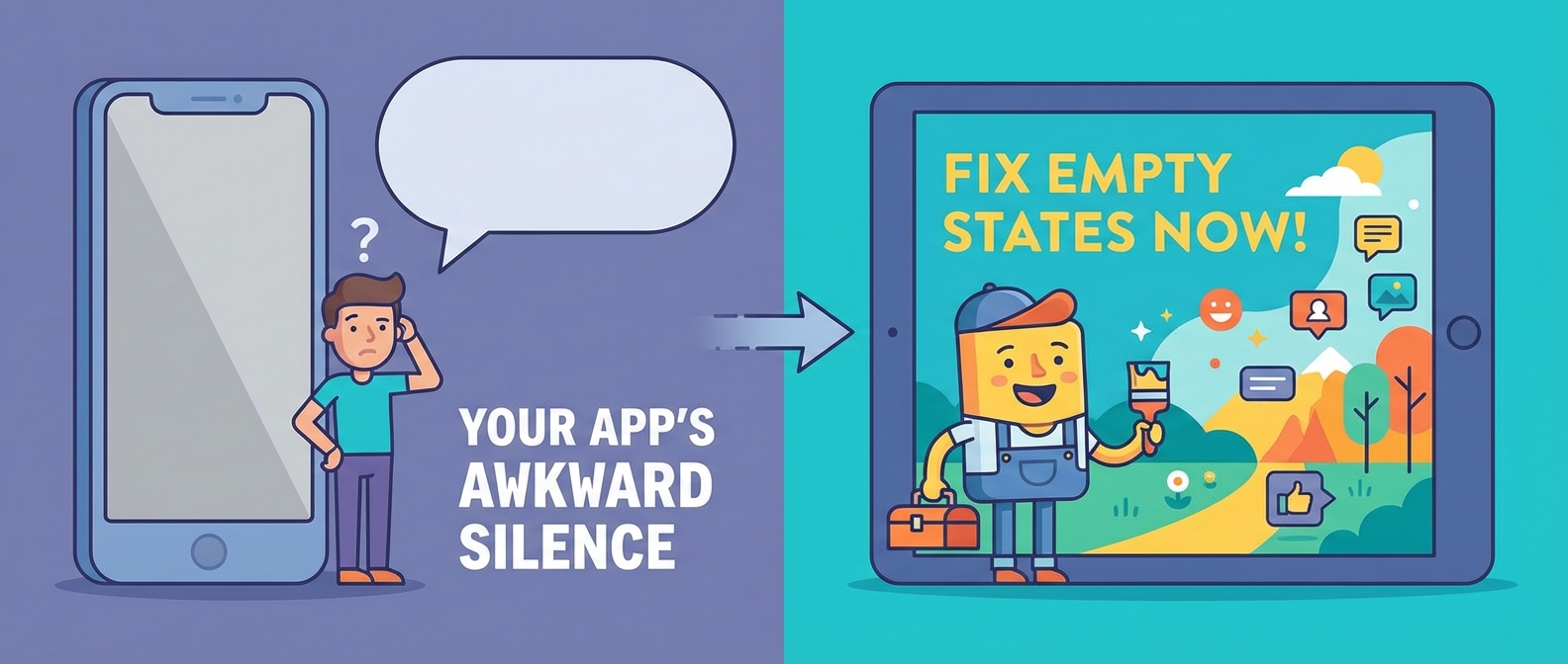
Your App’s Awkward Silent Treatment: Fixing Terrible Empty States
I’m on my second coffee of the day, and I’ve just landed in a digital ghost town. You know the feeling. You sign up for a shiny new app, full of hope and promises of ultimate productivity, only to be greeted by… nothing. A vast, white expanse. A screen that basically screams, “Well? What are you waiting for?” It’s the digital equivalent of walking into a party where the host immediately leaves the room. Awkward.
These digital voids are called empty states. They pop up when there’s no data to show yet—an empty inbox, a new project board, or a search for “unicorn-powered Wi-Fi routers.” Most of the time, they’re a complete design afterthought, a lazy “No items found” message that slams the door in a user’s face. It’s a dead end, and it’s costing you users.
Why Most Empty States are a UX Crime Scene
A blank screen is a momentum killer. For a new user, it’s a moment of pure confusion. “What am I supposed to do here? Is it broken?” This is a critical failure in the onboarding ux. You’ve convinced someone to try your product, and your first move is to give them the silent treatment. It’s like building a beautiful store but forgetting to put a “Welcome” mat out front.
Think of it this way: a screen with zero data is a blank canvas, not a brick wall. When you just slap “No results” on it, you’re missing a golden opportunity to guide, educate, and delight your user. This isn’t just about looking pretty; it’s about long-term user retention. If users get stuck or confused on day one, they’re probably not coming back for day two.
We’ve talked before about how a website can feel like a digital DMV. A bad empty state is the ultimate expression of that—an unhelpful space that makes the user do all the work.
See It In Action
Turning Nothing into Something Awesome
So, how do we transform these awkward silences into helpful conversations? We stop treating them as error messages and start treating them as a first date. Here’s your game plan.
1. Be a Friendly Guide, Not a Silent Robot
Your user is in a new place. Don’t just stand there; give them a tour! An empty state should briefly explain the value of the feature they’re looking at and tell them exactly what to do next.
- Instead of: “You have no projects.”
- Try: “This is where your brilliant projects will live! Create your first one to track tasks, collaborate with your team, and get things done. Ready to start? Click the ‘Add Project’ button.”
This simple shift turns confusion into clarity. It’s a fundamental principle of designing for how brains actually work—reduce the guesswork!
2. Offer a Shortcut or a First Step
The best empty states don’t just tell you what to do; they help you do it. The primary goal is to get data onto that screen. Provide a big, obvious call-to-action button that initiates the very first, most important action.
- For a contact list: “Import contacts from Google”
- For a design app: “Start with a popular template”
- For a music app: “Follow a few artists to build your first playlist”
Give them a button to press. People love pressing buttons. It makes them feel powerful.
3. Inject Some Personality
A blank screen is a perfect spot for a little brand personality to shine through. A fun illustration, a clever bit of copy, or a subtle animation can turn a moment of potential frustration into a delightful surprise. This is where you can use those micro-interactions we love so much.
Remember how a cluttered dashboard can look like a data crime scene? An empty state is the opposite—it’s a clean slate. Don’t make it sterile and boring. Make it charming.
4. Manage Expectations (Especially for Search)
When a user’s search comes up empty, don’t just declare failure. Acknowledge what they searched for and offer helpful next steps.
- Instead of: “No results found.”
- Try: “Bummer, we couldn’t find anything for ‘sentient tacos.’ Maybe try a broader search like ‘tacos’ or check for typos?”
This shows the system is working, reassures the user, and guides them toward success. It’s the difference between a locked door and a helpful sign pointing you in the right direction.
The Takeaway: Stop Wasting Your White Space
Empty states are not bugs or afterthoughts. They are one of the most important parts of your product’s user experience, especially for new users. They are your first, best chance to guide someone from “What is this?” to “Aha, I get it!”
By transforming your zero data screens from dead ends into welcoming guides, you’ll create a smoother onboarding ux, reduce frustration, and give people a reason to stick around. Better user retention starts by making a great first impression, even when there’s nothing on the screen.
