
10 Small Business Homepage Essentials That Turn Visitors Into Leads
Part of Small Business Websites
By Paul Peery · August 10, 2026 · 6 min readUpdated August 13, 2026
Heads up: this post contains affiliate links — if you buy through one, I may earn a commission at no extra cost to you. How that works
Most small business homepages lose potential customers within three seconds, not because the design looks dated, but because visitors cannot figure out what the company actually does or how to hire them. When someone lands on your site, they should instantly see what you sell, who you serve, and where you operate before their thumb moves to scroll. Vague taglines like 'Innovating Tomorrow's Solutions' sound fancy in corporate decks, but they leave actual local buyers wondering if you fix plumbing or consult on software. If you run a local business, pair your value proposition with SEO basics for a brand-new local business website so both human visitors and search engines immediately understand your service area.
- Done wrong: 'Transforming your physical spaces into modern sanctuaries.'
- Done right: 'Residential tile repair and bathroom remodeling in North Austin.'
Every page needs one primary action, not five equal options
Giving visitors five competing buttons above the fold creates decision fatigue. When a homepage presents 'Schedule an Inspection,' 'Download Our PDF,' 'Browse Portfolio,' 'Read Our Story,' and 'Join Our Newsletter' with identical visual weight, most people take none of those actions. Pick the single most valuable outcome for your business—usually booking a call or requesting a quote—and make that button impossible to miss. Secondary actions belong lower down the page or as subtle text links.
- Done wrong: Four bright orange buttons crammed into the hero section.
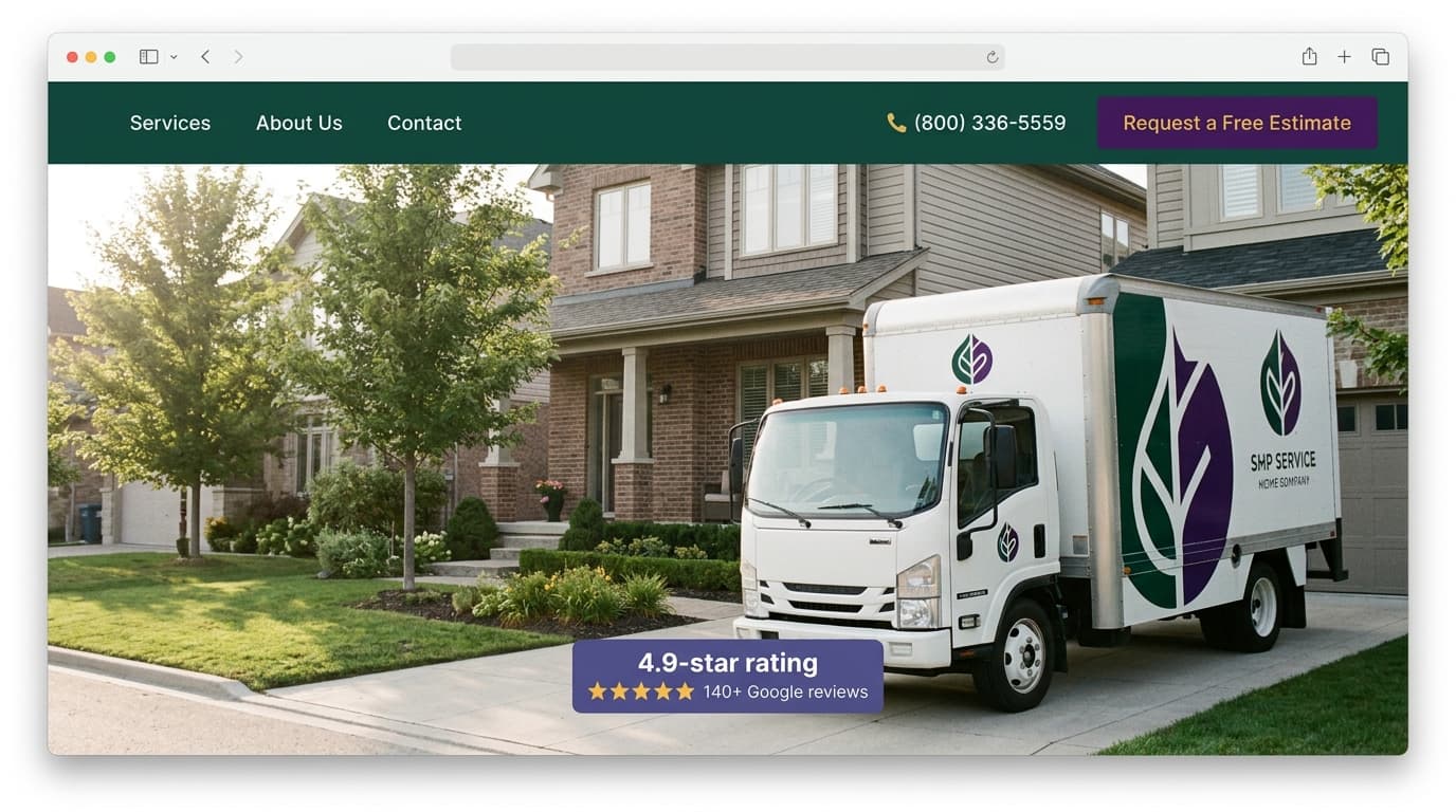
- Done right: One primary 'Request a Free Estimate' button in a high-contrast color, paired with a subtle secondary text link to 'See Our Work.'
Hiding your contact details drives local buyers directly to competitors
People looking for immediate local services do not want to hunt through a nested menu to find a phone number. If you run a repair business, a local shop, or a service company where clients call first, place your phone number and service region at the top of your header. On mobile screens, that phone number must be a direct tap-to-call link so visitors can reach you without copying digits into a dialer.
- Done wrong: A contact link buried in the footer menu with no visible phone number on the homepage.
- Done right: A sticky header featuring a tap-to-call phone number and your service city clearly displayed beside the menu.
Stock photography actively destroys local trust
Stock photos of smiling actors holding blueprints or high-fiving over empty desks tell potential customers that you lack real work to showcase. The trade-off here is clear: professional stock photos look polished, while real phone photos of your crew, work vans, or completed jobs might look slightly unpolished. However, real photos prove you actually exist, operate in the real world, and do the work yourself. Authenticity converts local customers far better than sterile stock imagery.
- Done wrong: A header banner featuring a model wearing a spotless hardhat bought five minutes before the shoot.
- Done right: A clear photo of your real service truck parked outside a finished job site with your company logo visible on the door.
Specific proof beats generic praise every single time
Vague claims like 'Best Service in Town' or 'Top Rated Plumber' mean nothing without verifiable proof sitting right next to them. If you want visitors to believe your service is dependable, show them evidence they can independently verify. Display your average review rating alongside the platform name, state how many years you have served your area, or showcase logos of local organizations you belong to.
- Done wrong: A floating banner claiming 'Voted #1 Service Provider' with no date, publication, or source.
- Done right: '4.9/5 stars across 140+ Google Reviews from homeowners in Denton County.'
Slow mobile speed turns away buyers before they read a word
If your homepage takes several seconds to load on a phone connected to a weak cellular signal, visitors tap back to search results before your hero image even renders. High-resolution uncompressed images, heavy background videos, and cheap shared hosting plans are common culprits behind sluggish performance. Before worrying about visual flourishes, run your site through free tools like Google PageSpeed Insights and focus on fast mobile rendering. Choosing the right foundation matters here, whether you build with Wix, WordPress, or custom code.
- Done wrong: Background auto-playing videos and 10-megabyte hero photos that stall on mobile connections.
- Done right: WebP formatted images, minimal third-party scripts, and lean code that displays hero text in under two seconds.
Visitors want a clear list of core services, not a philosophical essay
Your homepage should feature a concise breakdown of your main offerings with short summaries and clear links to dedicated service pages. Visitors rarely read long paragraphs about corporate founding stories when trying to figure out if you repair water heaters. Keep the homepage overview brief, highlight the primary problem each service solves, and let interested buyers click through for detailed scope and pricing.
- Done wrong: A three-paragraph wall of text describing a passion for craftsmanship without listing specific services.
- Done right: A clean three-column grid listing 'Drain Cleaning,' 'Water Heater Repair,' and 'Pipe Replacement' with one-sentence summaries under each.
Creative navigation menus confuse visitors into leaving
The navigation bar is not the place to invent new terminology or hide navigation behind custom icons on desktop displays. Visitors rely on predictable layout patterns when scanning a website. Keep your main menu limited to five or six clear labels so people find what they need without friction.
- Done wrong: Navigation links labeled 'Our Journey,' 'What Drives Us,' 'The Magic,' and 'Reach Out.'
- Done right: Standard links labeled 'Services,' 'About Us,' 'Reviews,' and 'Contact Us.'
Nameless quotes carry no weight; real reviews tell specific stories
Testimonials that read 'Great service! - J.D.' look like they were typed out five minutes before launch. Effective testimonials feature full names, broad locations or company names, and specific details about the problem solved. When possible, embed third-party review widgets or include photos of real clients alongside their words.
- Done wrong: 'Fast and reliable work, will hire again! - Mark S.'
- Done right: 'They fixed our leaking roof the same day during a heavy storm and kept the quote exactly as promised. — Mark Stevens, Local Homeowner.'
Complex contact forms prioritize filing systems over client convenience
Every additional input field on a contact form reduces the likelihood that a visitor completes it. Demanding a full physical address, project budget, timeline, and referral source before speaking to a human creates unnecessary friction. Keep your homepage form down to three or four simple fields—name, phone or email, and a brief message space. If you want to refine your conversion funnel, check out how to write a contact page that gets inquiries. Understanding how much a small business website costs can also help you decide where to budget for CRM integration and form processing.
- Done wrong: An eight-field form demanding full address, square footage, budget ranges, and project start dates.
- Done right: A streamlined form requesting Name, Email or Phone, and a short text field for 'How can we help?'
The one-paragraph homepage audit
If you want to evaluate your homepage right now, open it on your phone, disconnect from Wi-Fi, and answer four questions within five seconds: Can a visitor tell what service you offer and where? Is there a visible phone number or one dominant call to action? Are the photos from real jobs instead of stock libraries? Does the page load before you lose patience? If you can answer yes to all four, your homepage is already ahead of most competitors in your local market.
Keep reading
All posts
Local SEO for Contractors: Google Business Profile, Citations, and Reviews
You do not need a $1,500 monthly agency retainer to rank locally. Here is how independent contractors can set up Google Business Profile, citations, and reviews.
August 18, 2026 · 4 min read