
Five Accessibility Checks You Can Run Today Without a Developer
Part of Small Business Websites
By Paul Peery · August 13, 2026 · 5 min read
Your contact form is a dead end if someone can't tab to the button or hear what the fields are asking for.
That's what accessibility means on a small-business site: can a person actually finish the job they came to do? Contrast, alt text, keyboard use, and labeled forms aren't polish. They're how a customer with low vision, a tremor, or a screen reader hires you instead of bouncing.
I'm not giving legal advice. If you need to know what ADA or WCAG means for your situation, talk to a professional. This is the layer you can check yourself, today, with free tools.
The business case is simpler than the lawsuits
An inaccessible page doesn't only exclude people with disabilities. It also shuts out older customers, anyone using a phone in bright sun, and people who just prefer the keyboard. Clearer contrast is easier for everyone to read. Real form labels cut down on "I couldn't submit it" emails.
The same structure that helps a screen reader — headings in order, useful alt text — also helps search engines understand the page. That's why this overlaps with SEO basics for a new local site.
You still lose the sale if the form is unusable. That's the part you can fix first.
Run WAVE before you change anything
Open WAVE in your browser (or install the free Chrome/Firefox/Edge extension) and point it at your homepage and your contact page.
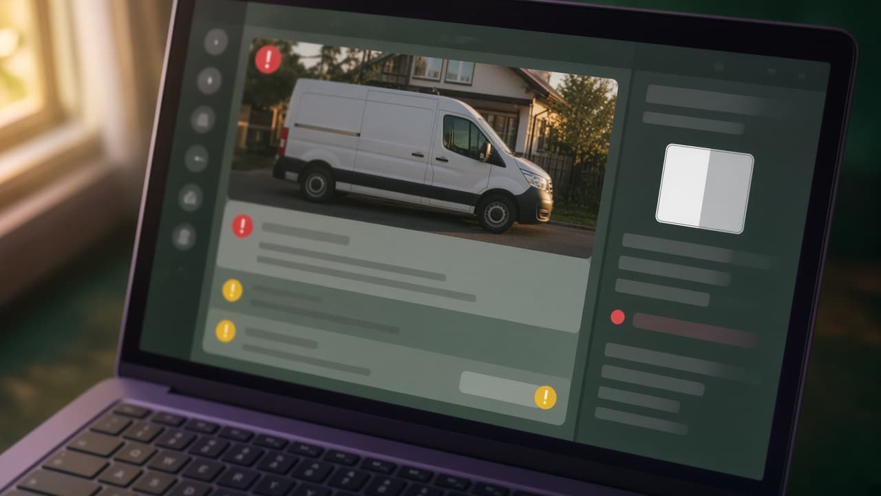
It paints icons right on the page: missing alt, contrast failures, empty links, unlabeled form fields. You don't have to read a report first. You see the problem sitting on the button or the photo.
WAVE will miss judgment calls. A green-ish result is not a certificate. It's a map of the obvious mechanical failures. Chrome's built-in Lighthouse audit (Inspect → Lighthouse → Accessibility) is a decent second opinion if you already have DevTools open.
Contrast is the problem you can measure in two minutes
Light gray text on white, or a pastel button with white type, looks "clean" on your monitor and disappears for a lot of people.
WCAG's common target is a contrast ratio of at least 4.5:1 for regular text and 3:1 for large text. You don't have to memorize that. Paste your text color and background color into the free WebAIM Contrast Checker. WAVE will also flag low-contrast text across the whole page.
If your builder or theme lets you pick brand colors, test the actual combinations you shipped — body text, links, buttons, the footer. Change the ones that fail. You usually don't need a redesign, just a darker gray or a stronger button fill.
Alt text is one useful sentence, not a keyword dump
Every image that carries meaning needs a short text alternative. Decorative flourishes should have empty alt so a screen reader skips them.
Write what the image does on the page, not a catalog description. A photo of your van on the homepage might be "Blue service van with ladder rack in front of a brick storefront." A headshot next to a bio might be the person's name and role. A stock icon that is already labeled in text next to it can stay empty.
Most website builders and WordPress have an alt field in the image editor. You can fix this without touching code. Skip stuffing keywords in there — it helps no one and looks spammy.
If you can't tab through it, neither can they
Unplug the mouse, or just refuse to use it. Start at the top of the page and press Tab.
You should be able to reach every link, button, and form field. You should always be able to see where you are — a clear outline or highlight on the current item. You should be able to open menus and close them with the keyboard. Shift+Tab should take you backward.
If focus jumps into a hidden popup, disappears behind a sticky header, or skips the "Get a quote" button, that's a real customer you just lost. Builders sometimes bury this in theme settings ("focus outline" or "keyboard navigation"). If you can't find the toggle, that's a note for whoever maintains the site.
Forms fail when the label is only a placeholder
Placeholders vanish when someone starts typing. Screen readers often skip them. Every field needs a visible, persistent label that stays put: Name, Email, Phone, How can we help.
Check that required fields are marked in text, not only with a red asterisk or a color change. If the form rejects a submission, the error should say what went wrong and how to fix it, next to the field — not a generic banner at the top.
This is the same reason a contact page that actually gets inquiries keeps the field list short. Fewer fields, real labels, and a keyboard-reachable submit button beat a long form that only works with a mouse.
What these checks can't do
They won't tell you if the alt text you wrote is actually helpful. They won't judge whether your heading order makes sense to a person. They won't catch a video without captions or a PDF no one can read.
A clean WAVE or Lighthouse run is not compliance. Automated tools are spelling checkers, not editors. If you later want scans that fail the build on every push, that's a different job — I wrote up the automated accessibility testing I actually run.
Treat this as part of regular website maintenance, not a one-time audit you file and forget.
Do this afternoon
- Run WAVE on your homepage and contact page. Write down every red icon you don't understand.
- Test your main text color and button colors in the WebAIM contrast checker. Fix the pairs that fail.
- Open every image in your editor and add or correct alt text. Empty alt for pure decoration.
- Tab through the whole page with the mouse unplugged. Note anything you can't reach or can't see focused.
- Confirm every form field has a visible label that isn't only a placeholder, and that errors are described in text.
Fix what you can in the builder today. Hand the rest to whoever touches the site. Then decide, with a professional if you need one, whether you need a deeper review. The five checks above are how you stop turning away the people who already wanted to pay you.
Keep reading
All posts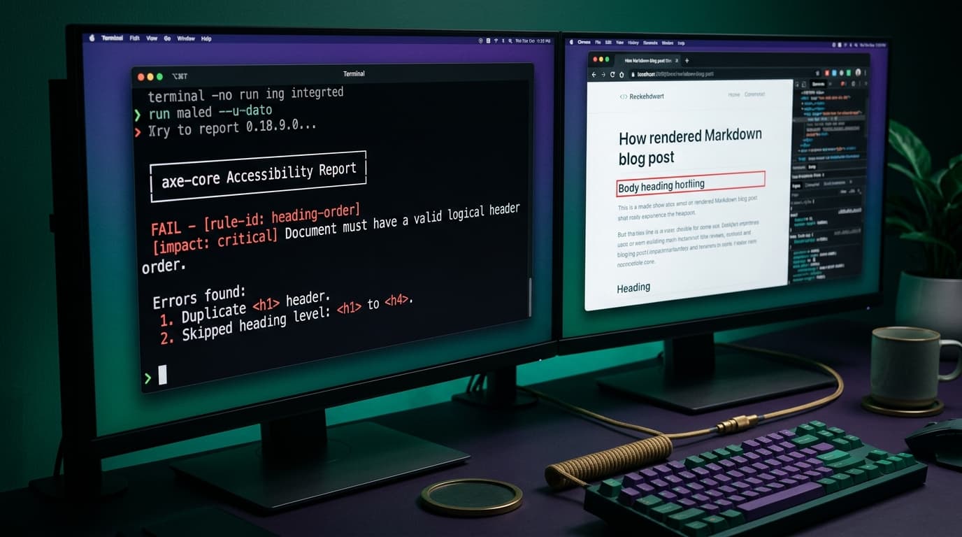
Accessibility Testing That Runs on Every Push (Not Once a Year)
My site runs an accessibility scan on every single push — axe checks plus heading-structure rules, across every public page and the signed-in admin, wired into the same browser tests that already run in CI. Here's the exact setup, what it has actually caught, and an honest list of what it can't catch.
August 2, 2026 · 3 min read